There is no shortage of landing pages on the web. From eCommerce to news to lifestyle sites, there remain very few name brand sites that haven't caught on to the idea of directing action with strategic landing pages.
Still, many newbies are unsure what differentiates an OK and a great landing page. While there are countless wonderful articles out there about the guidelines for creating a killer landing page, I always find it best to learn by example.
Thus, here's a look at some effective landing pages, and a quick assessment of what they're doing right:
Google Chrome
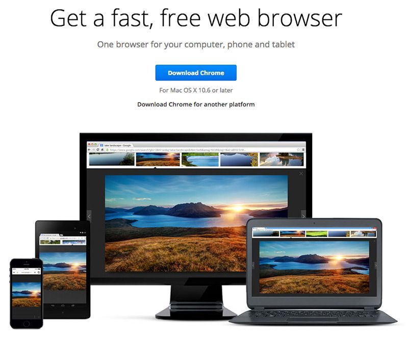
Why It Works:
- Button: If you came to the Chrome website intent on downloading Chrome, you'd have absolutely no problem finding the button to do so. Google has placed the download button front and center, in a color that pops, to direct attention there first.
- Visual: Google is clearly trying to emphasize that Chrome operates responsively, working on screens of all sizes. Rather than explaining this with text, they've used the classic multi screen image to display Chrome at work.
- Supplementary Info: If you're simply researching browsers and aren't yet set on Google's option, this page provides information on Chrome's features. It's not a download it or leave it page, it has the supplemental material that a researcher would find helpful.
Ashley Madison
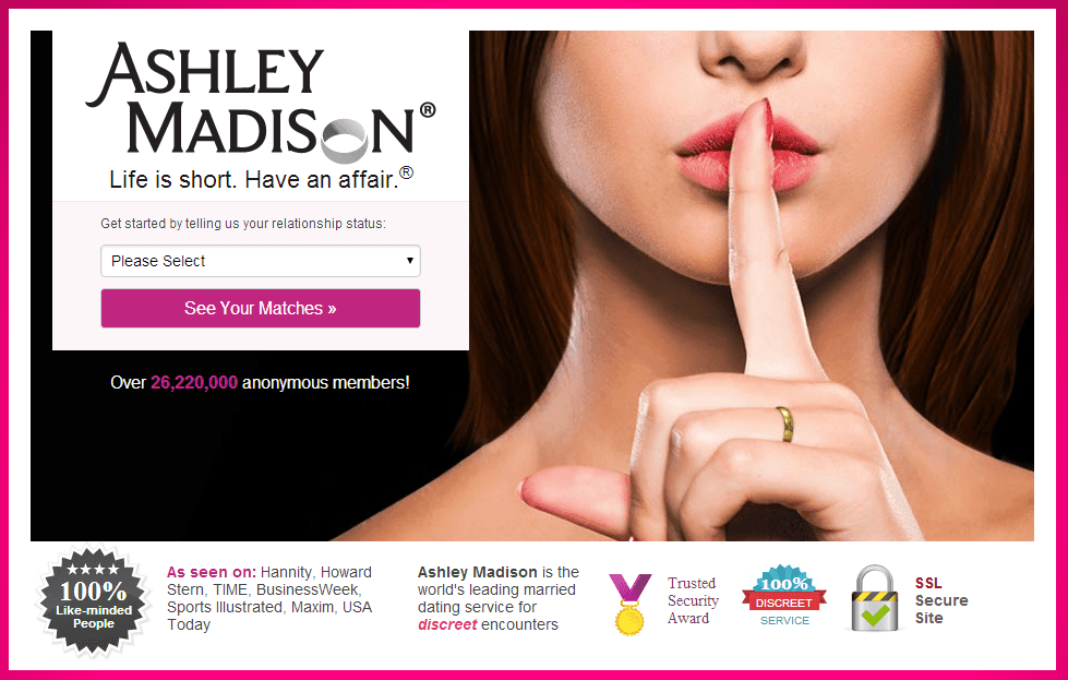
Why it works:
- Catchy copy: While it may be cringeworthy, the Ashley Madison homepage-landing page hybrid certainly grabs attention with the catch phrase "Life is short. Have an affair."
- Low barrier to entry: Rather than flooding the visitor with images of potential matches, the page clearly directs attention to the first step, which is simply identifying what kind of relationship you're in and seeking. Depending on the nature of a landing page, you may not want to use a complete form but rather opt for a simple first step.
- Social Proof: If you're unsure whether this service is for you, those 26.2 million other like minded members sure help ease the decision!
- Security Badges: For a site based on coordinating extramarital affairs, it's safe to say user information security is paramount. The page addresses this swiftly with badges that are easy to understand and reinforce their commitment to the preservation of privacy.
KISS Metrics
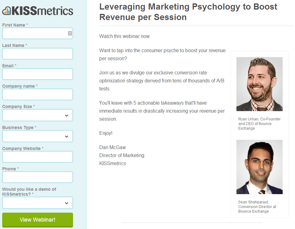
Why It Works:
- Strategic Format: While it may look unconventional, it's to coincidence that this page's form sits prominently at the left of the page. Heatmaps show us that users look first to the top left of a web page - which in this case would put their attention smack on the form that needs to be filled out in order to convert.
- Friendly Faces: Let's face it...webinars can be dry. With a brand as big as KISSmetrics, it's safe to assume that attendance at these webinars will be high, and attendees might anticipate feeling isolated. Including the headshots, rather than just the titles, of the webinar leaders makes this download much more personal.
- Benefit Focused: Do you notice how simple the copy is on this page? Landing pages don't have to cover every detail of an offer in order to work. Specifically, the text here focuses on the end benefits to the attendee rather than the webinar content itself. This copyrighting style speakers to the user on an intrinsic level.
MailChimp
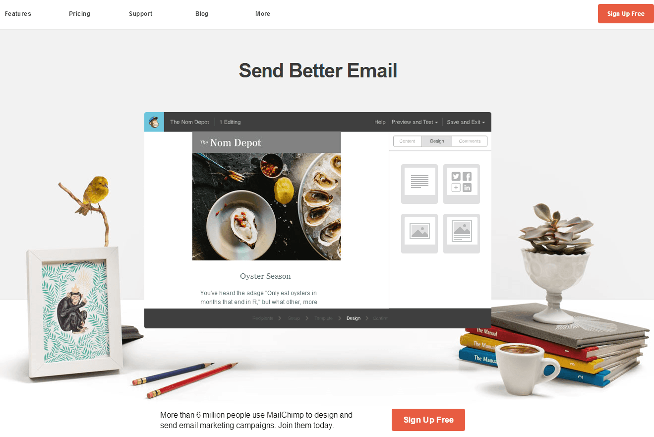
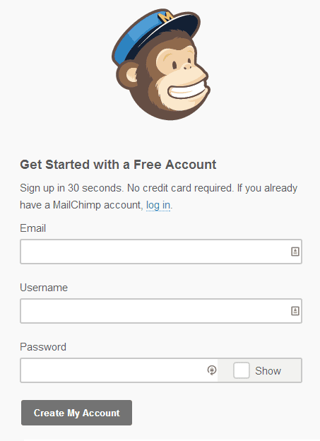
Double whammy! What you're looking at here is MailChimp's homepage and complimentary landing page that follows a click on the CTA.
Why it Works:
- Utter simplicity: We've discussed simplicity above, but the MailChimp free sign up takes it to another level. I've done it, so I'm here to report that you truly can sign up for their service in under 30 seconds. Which reminds me...
- Honesty: When a landing page or CTA makes a promise, a failure to deliver on it spells a catastrophe for the trust your visitor once had in you. Take a page from MailChimp's book at only make landing page claims that you can back up.
Evernote
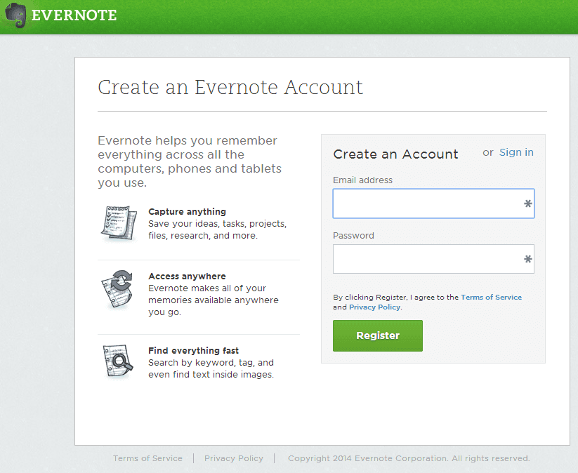
Why it Works:
- Avoiding the benefit drop off: Although MailChimp does a great job keeping their landing page simple, they sacrifice some benefit communication in doing so. Evernote has managed to create a page that's clean and to the point, but still reminds the reader why they should be interested in the first place.
- Visual Communication: Like nearly every company above, Evernote knows that images speak louder than words. Incorporating these simple graphics may seem inconsequential, but they actually help the reader subconsciously process the information provided.
I'd love to include your landing page in our next round of reviews - drop us a line and let us know what you're doing that's converting like crazy!