
One of the major changes in future Joomla 4 will be the adoption of CSS Grid.
CSS Grid is revolutionizing the front end design industry. It is fast becoming an Internet standard.
Joomla most likely will keep Bootstrap 4 for backward compatibility. However, the future is clear.
Long-term, the future of Joomla frontend design is CSS Grid. You already can see CSS Grid in action in Cassiopeia, the default frontend template for Joomla 4.
In this blog post, I'm going to help you master the key ideas behind CSS Grid.
CSS Grid is a new CSS technology in its first specification. This system allows designers and developers to place items (HTML elements) in a grid-based layout using columns and rows.
It may sound like a table based system, but there’s much more in CSS Grid than designing in a table.
CSS Grid allows you to lay out the elements of your design independently of their document source order.
Part #1. The Concept behind CSS Grid
The basic concept of CSS Grid is to take a HTML element and divide it into rows and columns, turning it into a grid.
You can then place the direct children of this element anywhere on the grid.
Grid items have to be direct children of the main grid container. These are the elements available to put on the grid.
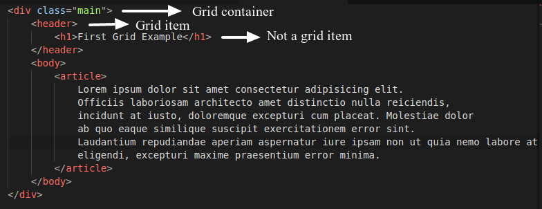
Take a look at the image below.
If you declare the wrapping div container with the class=”main” as a grid, only the header and body elements will be considered as grid items.
The <h1> and <aside> elements are contained inside grid items but are not grid items themselves.
A grid item can also be a grid container. That means you can nest grids inside grids indefinitely.
You can also insert a flex container inside a grid container or vice versa. This provides a lot of flexibility when designing and laying out.
You can style all the items inside a grid because all of them are declared in the HTML of your document.
You won’t be able to style the grid itself - it exists only in CSS.
Part #2. Basic CSS Grid Terminology
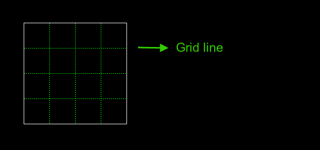
Grid line
This is the most basic unit of the grid. The components of a grid are defined by placing one or more grid lines.
Lines can be referred to by number or you can even give them a custom name.
This is very handy when working with more complex layouts (more on this in future posts).
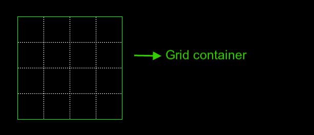
Grid Container
This is the wrapping element for all the grid items. You define a grid container with one CSS property.
Example:
 .main {
        display: grid;
} 
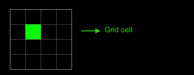
Grid Cell
A Grid Cell is the smallest surface surrounded by 4 grid lines. This is analogous to a spreadsheet cell.
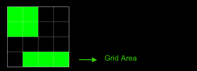
Grid Area
Grid Area is any rectangular (or square) shape composed by many grid cells.
Notice that the current CSS Grid module allows you to define areas in a rectangular or square shape, but you won’t be able to define an “L” shaped figure for example.
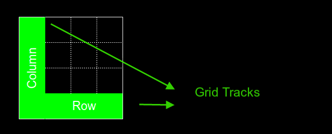
Grid Track
Grid Track is a broad term to identify rows or columns.
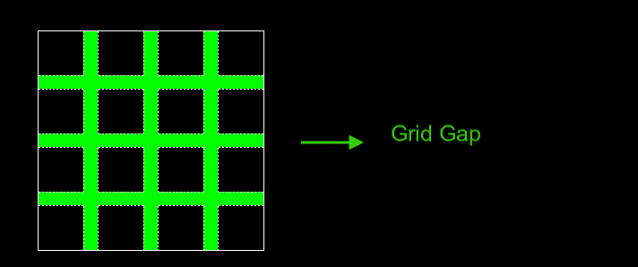
Grid Gap
Grid Gap is the space between Grid Cells or Grid Areas. It acts similar to the margin.
You cannot place content in the Grid Gap. By default the Grid Gap is 0, that means, there is no separation between the cells in a grid.
The gap is defined with the CSS grid-gap property.
Part #3. Creating Your First CSS Grid
Now that you have learned the basic concepts of the CSS Grid Specification, it’s time to build your first grid.
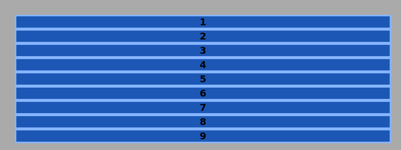
- The grid will contain 9 elements.
- Each one of these elements will be laid out in a 3x3 grid.
- Each column will have a width of 100px.
- The grid items will be separated from each other by a 20px gap.
The HTML Code
<div class="container">
       <div class="item">1</div>
       <div class="item">2</div>
       <div class="item">3</div>
       <div class="item">4</div>
       <div class="item">5</div>
       <div class="item">6</div>
       <div class="item">7</div>
       <div class="item">8</div>
       <div class="item">9</div>
   </div>
As you can see, this is only a div containing other 9 divs.
The CSS Code
Add some basic styling:
/* GLOBAL STYLES */

* {
    box-sizing: border-box;
}

body {
    background-color: #AAA;
    background-size: 340px, auto;
    margin: 50px;
}

/* Each item in the grid contains numbers */
.item {
    /* Center the contents of the grid items. Making each grid item a Flex Container */
    display: flex;

    /* Horizontal and Vertical centering */
    justify-content: center;
    align-items: center;
    border: 5px solid #87b5ff;
    border-radius: 3px;
    font-size: 2em;
    font-family: sans-serif;
    font-weight: bold;
    background-color: #1c57b5
}
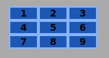
Every element inside the containing wrapper has been defined as a flex container. This allows us to easily center the content horizontally and vertically.
This flex container will work inside a grid container without problems. The output in your browser will look like the image below.
Time to declare the grid container:
.container {
    display: grid;
}
This code turns the div with the class container into a grid container and all child items inside it into grid items.
If you take a look at your browser, you won’t see any changes.
That’s because you already have defined a grid container, but you haven’t specified yet how the items inside that container will be placed.
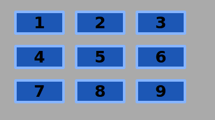
Add the following line to the code and save the file:
.container {
    display: grid;
    grid-template-columns: 100px 100px 100px;
}
The grid-template-columns property allows you to define the columns of the grid.
In this very basic example, you just have explicitly defined 3 columns. Each one of this columns will have a width of 100px.
Notice that you didn’t define the rows in the grid. These have been added in an implicit way by the browser.
A rule of thumb is that if you define the columns or rows in a grid, it’s called “Explicit Grid”. If, on the other hand, the grid items are placed automatically by the browser, it’s called “Implicit Grid”.
Notice also that there is no separation between the grid items.
This separation is added with the grid-column-gap and grid-row-gap properties.
There’s a shorthand that integrates both properties: grid-gap.
.container {
    display: grid;
    grid-template-columns: 100px 100px 100px;
    grid-gap: 20px;
}
You can use other kinds of measuring units besides pixels. I will touch on this in one of my next tutorials.
Congratulations! You just have created your first CSS Grid!
Part #4. CSS Grid in Joomla 4
Now you know about CSS Grid, click this link see it in Cassiopeia, the Joomla 4 default template.
All the code related to CSS Grid in Cassiopeia is wrapped by the @supports rule. This checks if the visitor's browser has support for an specific CSS property and its value. In the file we linked to above, Joomla is checking to ensure the browser can display this code: display: grid.
@supports (display: grid) { }If the browser is too old to support CSS Grid, the CSS won't be executed. This page shows which browsers support CSS Grid.
Get our CSS Grid Explained Book
All Joomlashack Pro members get access to our "CSS Grid Explained" book. All you need to do is sign up for a Joomlashack extension, template or training membership.
In this short book, you are going to master the key ideas behind CSS Grid. This book is in the best traditions of OSTraining. There are no long-dense paragraphs of theory. You pick up the book and you start writing code immediately.
In the first chapter, we start with the basic terminology. You'll learn the difference between Grid Areas and Grid Cells, between Grid Tracks and Grid Gaps.
Then, using a hands-on approach, you'll start building CSS Grids. There are 9 different exercises in this book. You'll build everything from the most basic CSS Grid to a full site layout.