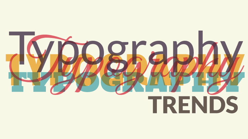
The current web design trends take a turn to minimalism, with flat design coming out in the lead. When you strip away many visual elements that create a visual impact, you rely heavily on typography to make your design beautiful. 2014 is shaping up to be an exciting year for typography trends, particularly if you are working with responsive or flat designs for Joomla. Keep an eye out for these popular trends, and consider incorporating them into your own designs if they need a typography face lift.
Crisp, Sharp, and Plain
Flat designs have a major need for top end fonts, since a great deal of the visual draw comes from the fonts you use. Flat design fonts look great with limited manipulation due to their simple nature. Clean, crisp lines and plain fonts overall characterize this particular style. These fonts are also universally easy to read, so if you're looking to punch up the readability of your site, cruise around some flat designs and get typography inspiration. Roboto and Montserrat available for free on Google web fonts, or the widely used and extremely expensive Gotham, are three examples of fonts that work well with flat designs. You can see that fitbit.com, kinhr.com and tictail.com use flat design, nice and inspiring photography and simple typography to great effect.
Handwritten Fonts
The digital age takes away some forms of personality, but handwritten fonts seek to add that back to your designs. These fonts give your website a more organic look that works well for certain sites, such as those targeted at children, craft websites, and food sites. It's a warm and welcoming type of typography that sometimes runs into problems with readability. A general trend towards fonts with personality extends beyond handwritten fonts, making typography center stage for 2014 design trends. The young and rounded Indie Flower and the more formal and elegant script Parisienne on Google web fonts provide you with a starting point for handwritten fonts. Souppeddler.com is a soup delivery service that shows this trend in food related websites.
Ed Banger Records website shows how this trend may be cleverly used on websites dedicated to alternative music. While handwritten font seems an obvious choice for site dedicated to children as winshape.org
Mobile Friendly Typography
Mobile users continue to rise, a trend that's not going to change as laptops get swapped out for tablets and smartphones. You deal with extremely limited space on mobile screens, so readable and iconic fonts are a must. Responsive websites make the design side of things easier to deal with, so your main goal is making the content as readable as possible even when they're on a small smartphone screen. The right font goes a long way to making this happen, so it's important to hit the mark when you're sending your designs out into the wild. Source Pro, Adobe's first open source typeface family available on Google web font, has been designed by Paul D. Hunt to be both legible in short text lines as may happen for small devices, as well as being comfortable to read in longer passages of text on big screen. Proxima Nova, defined by somebody as the “New Helvetica”, is another great typeface that with its regular shapes and clean strokes has become one of the favorite on the web for long reading and small text.
Conclusion
When you are about to create a simple, clean and functional website, it is important you dedicate special attention to the typography you are going to use: ensure that it is clear and highly legible, suited for any kind of devices and screen size, but most of all, choose for something unique that enhance the style of your site and give a unique identity to your project.
Author: Eddie Tabush - - lots of help from Chiara Aliotta