Whether you're exploring the whole RGB spectrum or bringing something fresh to black and white, color is one of the most important parts of website design. It's one of the first things users notice when they open up a site, and it instantly says a lot about the client and service or product they offer. Both color extremes are buzzing trends right now, so it's a great time to go ahead and experiment with using bold choices to add drama to your client's site. Here are some tips on when to go with monochrome and when to let your colorful fantasies play out.
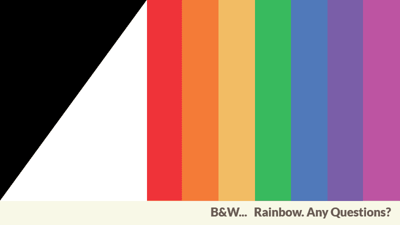
Two Colors are and can be Enough
Using a spare color scheme tends to have a streamlined impact on the page. It's a great way to help showcase large images (whether colored or monochrome), so it can be a good choice for portfolio websites. Leah Hagger's site uses her portrait on the front page to balance a minimal layout. The text-light presentation helps emphasize the drama of the black background. On the other end of the spectrum, some text-heavy websites also look great in black and white. It makes text more easily readable and helps you avoid the challenge of how colors look on different monitors and platforms. Simon J Hunter uses grayscale photos to frame classic black-on-white text for his homepage. Be careful, though, not to play it too safe. Use layout and font to help give the site more character.
Full Spectrum
Colorful websites are great for clients who want to showcase a broad range of work. Graphic design, branding agencies and web designers can all benefits from a scheme that packs an instant "wow" punch. Vivid colors help make a site memorable. Havaianas uses brights to communicate the brand's global, fun-loving image. But, you don't have to steer toward Crayola colors to make a rainbow site work. Duirwaigh Studios uses saturated tones and dimensional imagery to create a fantastic effect. The site's blue, red and cream homepage employs similarly rich tones to unite the various page elements. You don't have to use black, white or gray to offset colors, but you do need some balance for vivid shades. That can be serenely-tinted text, a flash of neutral background, or a quiet navigation bar.
Tell us what is the kind of website you design or like? Give us your comment about your preferences for a vivid colorful website or a more dark and simplistic website. Feel free to post some examples to reinforce your opinion. We would gladly share them with our community.