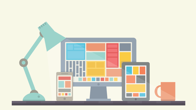
Grid Layouts Rock!
Nothing trumps a reliable, easy-to-use UI. No amount of killer graphics, clever landing pages, or HTML5 showboating can equal a site that displays information clearly and concisely. Grid-based layouts are a perfect tool to do that. They can present a huge amount of content at a glance, and are easy to update. But, keeping them interesting can be a challenge. Here are some tips to bring the "wow" factor.
Keep it cohesive
One of the dangers of this layout is that it can feel cluttered. You have to give it a seamless look. Grid layouts can't feel arbitrary. Your readers' attention gets scattered if the layout looks like it's thrown together. If you are using a lot of images (and it's not a news-based site), pick ones that are similar in color scheme or composition, like Canvas Magazine does with its neutral photos. Viktoria Klein uses images that are linked by color, pattern or content to add variety while still keeping the aesthetic flow.
Lay it out like it's being read
People read left to right. They start scrolling left to right. On a grid layout, it's important to remember that when you are deciding where to put the most important items on the page. Keep a majority of the essentials in the left half of the screen, so readers don't have to "hunt" for them on the page. Hotel BPM does that by keeping the "rooms" tab and the about info at the top and left of the screen. Dundee Contemporary Arts keeps all information on current events on the left.
Play with the palette
The linear look of a grid layout can feel harsh or clinical. Sometimes, a basic color scheme works well. But you don't have to be stuck with conventional tones. Working with unusual colors can help a grid layout have personality. Try a bright background with black or white grid items for a high-impact approach. Or, try juxtaposing a dark background with gray instead of white, like Simeone Deary's site does. If you are looking for something softer, working with shades in the same or related color families can make a grid more inviting. Just make sure any text is clearly legible. If you can't tell if it's readable, trying looking at the site in a variety of lights (or on mobile device, if applicable). Oasis Collections uses white text on both black and colored backgrounds for a consistent look and high contrast.
And remember, rules are meant to be broken. Even if you are basically working within a grid format, introducing a strategic circle element or making a page asymmetrical can add to the overall look of the site. However, it can't interfere with UI clarity. Building better sites always has to put ease of use front and center.