You spent all this time creating a piece of content that you want people to download, whether it was an eBook, whitepaper, or webinar. You are so excited to put it up on your website, the only problem is, nobody is downloading it.
You have done a lot of research on landing pages and you think you've mastered it pretty well so you don't think this is why people aren't downloading your content. In fact, people aren't even really getting to your landing page.
Stumped on what the problem may be? Have you even thought it might have to do with your call to action (CTA)? Let's discuss a few key things all of your CTAs should have in order to have the higher click through rates.
Can people see it or are people scared?
Take a quick peek at your CTA. Is it too small that you can't read the font or is it too big that it takes over a lot of space? Your call-to-action should be in the happy-medium size range.
I know this does not give you much indication of how big you should make it, but use common sense. You don't want the CTA too small that people will not be able to read what you are saying, but you don't want them to be scared away with a billboard-like call-to-action.
Use images
If you created an eBook or whitepaper, it should have a cover to it. Put the picture of the download right on your CTA. This way people will see what they could potentially download before actually downloading it.
People are very visual and like pretty things so make sure you include a graphic (don't go overboard) that will spark their interest and make them want to download it or at least click on it to learn more.
Use contrasting colors
If you want someone to click on your call-to-action button, you have to make it stand out. A great tip is to choose a color on a color wheel for your main color for your CTA and then look on the opposite side of the chart and select that color for your button (AKA complementary colors).
Because these colors or on the opposite sides of the color wheel, they look different from each other and the button will pop out of the page. It shows the reader exactly what they should be clicking on.
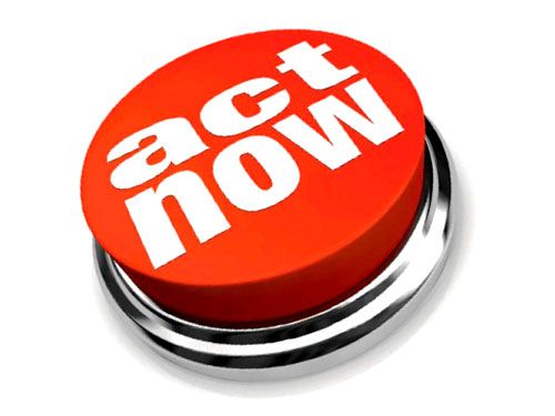
Create a sense of urgency
With the CTA copy and the button, you want to create a sense of urgency. Use words like: don't delay, act now, hurry in, and call now. However, you don't want to come off as being "salesy" and pushy.
Another way to get people to feel like they should click on the CTA is by creating time-sensitive offers. Saying things like: for a limited time only or spots are limited and usually fill up fast, people will want to make sure they get one of those spots.
You should have two call-to-actions. One of them should be above the fold and in the right column. The other one should be at the end of the page so that when they scroll down, there is still that offer available for them.
A/B testing
If you don't know which color or copy you should use, try out both of them. You can A/B test different options and see which one has better click-through rates.
Make Them Clickable
This is obvious, but just in case you'd forget I thought I would remind you. Make sure you make your CTA clickable. You don't want to put one on your page and then have it go nowhere.
It's simple. All you have is embed a link to the landing page and voila.
Now that you've mastered your call-to-actions, you should make sure your thank you pages are up to par.