A landing page is probably one of the most important parts of any website. It's the point in the visitor's journey where they make the leap and convert on some sort of offer. However, even though this is such an important piece of your Joomla website, it is often one of the most overlooked sections to make improvements.
In today's blog we are going to look at some of the important best practices and tips for creating high converting Joomla landing pages.
Powerful & Clear Headlines
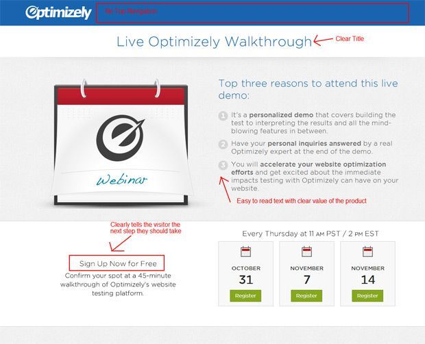
One of the first things the user will see is the headline of the landing page. It's very important that the headline is consistent with the rest of the verbiage of the campaign and clearly articulates what the offer is and what the user should do.
- [example] Free eBook: Guide to Choosing a Commercial Law Firm
The sub headline then can be used to express the value of the ebook and give the user a push to download it
- [example] Download it now and learn what key traits your commercial law firm should have so you don't pick the wrong one.
Easy to Read Copy
No one likes reading lots of text online, we all skim. So it's very important to keep the copy very short and to the point, leveraging small, easy to read paragraphs. You should also use different formatting elements such as bullet points or indents to make it very easy to read the copy.
Make the Value Clear
When writing your copy, it's very important that you make it very clear to the user what value they will receive after converting on your form and getting your product and service. Explain what problem they will be able to solve and how that might affect their lives.
Showing the value and results is the most important, however, after that you can drill down into the specifics on what the offer is made up of (ex: specific points covered in an ebook).
Leverage Images
Because people don't read all of the text, they are naturally pushed towards strong images. The image you pair with the landing page should be clearly showing what the user will receive after converting on the offer (3D ebook) or it should reinforce the value they will get and how their life will be better after converting (showing a happy, smiling room of marketers or a up and to the right graph)
Be Consistent
One important thing to keep in mind when developing your entire marketing campaign around a certain offer is the level of consistency you bring across all of the pieces of the campaign. It's important that the messaging and visuals of the social media post you make match the call-to-actions on the website. The call-to-actions must match the landing page and everything must match the offer they receive.
Make sure the verbiage of all of these items are consistent throughout the visitor's "flow":
- First touch (initial social, email, etc).
- Call to actions
- Headline
- Form title
- Form submit button
The more consistent you can make everything the better because it will create a clear "flow" for the user to travel on and keep them moving forward. At the point where something is not consistent the user may get confused and move else ware.
Clear Out Distractions
You've worked so hard to create a good visitor flow to move visitors to the landing page, the last thing we want is for them to get distracted or click to another part of the website. It's important that you remove distractions such as the top navigation, bottom navigation and other buttons, offers, images or text that do not directly relate to the offer.
In Joomla, this is as simple as turning off all of those modules for the landing page's menu item so that they do not display. You will want to leave the logo (linked to home page) turned on so that the user does have some path to navigate away from the landing page if needed.
Simple Forms
Forms can be a bit tricky because they require a balance of keeping the form short while still collecting enough information to be able to target more marketing around and inform your sales teams. The length of the form should also correlate with the value of the offer. Something like a small checklist should be a smaller form than if you're doing a free 1-on-1 training session.
You will also want to tailor your forms for different stages of the funnel. If it is a top of the funnel offer, you will probably ask way less questions. In this case, I would recommend simply name, email, website and 1-2 persona identification questions such as "Job Title" or "Industry" so you can segment them by persona.
If it's a bottom funnel offer, you will want to ask more questions to help arm your sales team with the right information they will need to best communicate to the lead. If done correctly, the lead will be pretty open to submitting a lot of information at this point because you have nurtured them and developed a relationship with them.
Build Confidence with the Visitor
There are many ways that you can boost the confidence with the visitors. These include:
- Build Trust – Include a mini-bio of the person who created the item along with any major certifications or accomplishments to help build authority
- Social Proof – Include how many people have converted on an offer or social buttons that show off the number of shares. You can also include a recommendation from an influencer in that industry.
- Similarity – Showcase a testimonial from someone who matches that persona's group
- Scarcity - Only offer a limited number of the item or only for a limited time to help push users to convert on the offer.
For more on this topic, I would highly suggest checking out Richard Cialdini's book:"Influence: The Psychology of Persuasion"
Add a Video
Adding a video on a landing page can be an amazing way to communicate value and show the person they will be interacting with. Show off the product or service that they are converting on so they can get a preview of what's behind that "gate" (the form).
I'd also suggest having the person the user will be directly working with or reading content of is the person in the video. This will help develop a little more trust and break down a level of apprehension with converting on the offer.
Consider Mobile
It's important to also keep in mind how your landing page looks on various mobile devices (smart phone, tablet, TV, etv.). Now that more and more website traffic is coming via mobile device, not having a great looking landing page can kill your conversion rate on mobile and overall.
Make it Easy to Share
People love sharing out great offers and content with their friends. It helps that person feel like they are "in the know". Because of this, make it very easy for people visiting the landing page to share out the landing page to their social and email channels.
If you are not using an extension like jInbound, there are many other social sharing extensions you can install to get this functionality.
These are some of the best tips for creating high converting landing pages. It's important to keep in mind that this is simply a starting point and that you must continuously test, measure and improve on your landing pages. This is where A/B testing can come very handy so you can run scientific experiments to see how it affects conversions.
If you have questions, please post them in the comments below and I'd be happy to answer them.