On more than one occasion I have heard people compare our web design industry with architecture.
It’s an easy comparison to make. Websites are a lot like custom designed buildings. The client, for a web site or a building, will approach a designer with a specific set of needs and objectives he or she needs to incorporate into the design. Both may have difficult problems that need to be addressed in an elegant, efficient, and flowing manner. Both need to editorialize and often fit less rather than more. The parallels between the two industries are many.
As you may know, there are many celebrity architects. As can be expected, they’ve become famous as a result of designing remarkable buildings. Take Frank Gehry, for example. Gehry has been designing inspiring buildings since the 70’s. However, the bulk of his notoriety could be argued, came as a result of his titanium-covered Guggenheim Museum in Bilbao (inset). Since he built the museum in 1997, he has gone on to build many other buildings that resemble the Guggenheim in Bilbao.
You can see any of these other titanium-covered buildings and instantly know he designed them. In fact,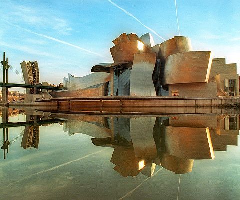 the institutions that hired him, probably told him they wanted a “Gehry building”. In that regard, Gehry was expected to place his style and taste before that of his clients.
You could say the same of many other famous architects who also imprint everything they design with their own design aesthetic and style. Calatrava, Piano, Foster, Pei, are just a few architects who do this.
But you can’t say the same of great web designers. For that reason, I don’t think Gehry, because he is so famous, would be a very good web designer.
After a few “titanium sites”, the look would quickly grow tiring. More important than looking tired, the Gehry’s style would dominate the site instead of the client’s brand. As near as I can tell, Gehry has designed more than seven titanium tile covered buildings and I am certain that the novelty of the wavy titanium finish did not impact the same way on the seventh as it did on the first. Though they vary in size, purpose, scope and location, and I believe that each is a true work-of-art, the architect has already moved on to something different for his recent projects.
A great web designer then, should not be like a great architect. A great web designer will consider placing his own style on hold while he or she designs a web site that is intrinsically tied and recognizable as an extension of the client’s branding. The mastery of his craft will be his ability to fit the customer’s needs into the space in an elegant composition while it remains as easy to use as possible. The designer’s style, unless given tremendous liberty by his client, will usually blend and disappear into the site.
There are entire sections in bookstores on good web design. I am not attempting to summarize what good web design should be. I will only say that a good website should be an extension of the client and the brand and not the designer’s personal taste. Look at the portfolio of any great web designer and you should see sites that are polar opposites of each other, each designed to match that client’s needs - - they may even be extremely different from the designer’s own site.
Where does this leave us, your humble template provider?
We like to think of ourselves as suppliers of well-built modular “buildings” designers can customize, redecorate, and modify to fulfill their client’s objectives while saving them time, work, and headaches. Look closely at all our templates and you will see a pattern. In the same way we believe that the designer should not imprint his style over that of the client and the brand, our template’s design elements, module positions, even their backgrounds are designed to blend, disappear, and be putty in the designer’s hands.
Recently, I have seen a new trend emerging. I’ve noticed pretty templates from some traditional as well as some new suppliers. However, upon closer inspection I realize that what makes them pretty is also what is going to make every site built with these templates look exactly the same! I’ve seen templates with interesting design elements like torn colored paper modules and backgrounds, animated backgrounds, antiqued and customized edges on modules, or some with cloth-like or craft-paper texture on the background - - I could go on and on. Look for them and you too will see that these pretty elements are like Gehry’s shiny titanium tiles. They make a nice first impression, but how cool will they be after you’ve seen them in thousands of sites? Furthermore and more important, how are they relevant to the client and his brand?
Templates are designed to make your life easier. The demos are there to help you see what can be done with the template. Use both to save time and get ideas, but try not to copy the template demo identically. Choose a template wisely, and remember, as an artist, your greatest challenge will be to remain true to yourself while you place the needs of the client and his brand first. You are not Frank Gehry, after all.