Welcome to the third post in our 5-part series on the Gantry 5 framework from RocketTheme.
In the previous post, we learned how to build a simple website using Gantry and the Hydrogen template.
Now that we've created our first website, let's look at creating a more advanced layout.
Normally, as a Joomla user, we would now add some modules to the site. However, Gantry 5 introduces a few other ways of adding modules.
Extra layout options provided by Gantry 5
Most of Gantry's layout options use Particles.
Particles are pieces of content, similar to a module, but living only inside Gantry.
Gantry has several types of Particles available:
- Standard Particles: Logo, Branding, Copyright and other standard items in a design.
- Position Particles: These are core Joomla template items, such as the main content, the system messages and the module positions.
- Atom Particles: These are code blocks, used for items such as Google Analytics.
Before actually using these, let’s first see how to set them up. This is done from within the Settings tab of the template:
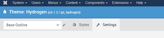
One thing to note: always check that you are working in the correct Outline of the template. The name of your outline in this example is "Base Outline".
#1. Default Particles
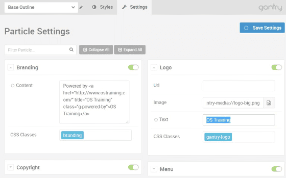
Hydrogen, the default Gantry 5 template, ships with sample Particles. We can change those Particles as we wish.
Some Particles that you will often have to modify are Logo and Branding, as these are shipped with Gantry's own images. Let’s first change those as an example:
Make sure to click "Save Settings", and check to see that your changes are applied to the front-end.
There are a few more Particles, most of which are easily understood. Many of these only need to be set once on a global level, as items like Logo, Date, To-top-scroller and Copyright will be consistent across the site. For these, it makes most sense to set them globally.
However, we also have the Custom HTML and the Sample Content Particles. For these, you might as well leave them empty globally, as you will usually use them more than once. You can use them as empty instances to apply within the Layout tab. Let’s work with the Sample Content Particle as an example:
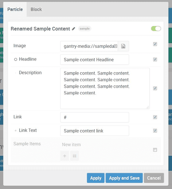
The Particle that best displays the power of this system is the Sample Content Particle. It is a perfect example of how you use Particles as an alternative to Custom HTML moudles. Using the pre-defined fields for Image, Headline, Description, Link and Link Text you can easily add content, also as a non-coder.
- Switch to the Hydrogen – Default Outline using the drop-down on the top-left.
- Go to the Layout tab.
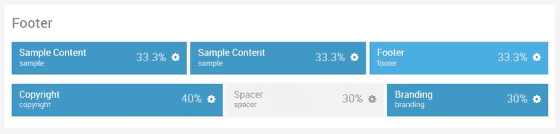
- Add 2 instances of the Sample Content Particle to the Footer row. Simply click and drag it to this position (or any other position you like):
- Click the cog-icon to edit one of your Sample Content Particles.
- Rename the item and populate it with your own text and images:
- Save your Particle and visit your frontend to see your updated Sample Content.
Note that it can be useful to prefill the Sample Content Particle on a global level if some of this content is the same on most pages.
Rockettheme templates ship with many more pre-configured Particles. In the Callisto template for example, you find many more, such as an Image Grid, Promo Image, Simple Counter, and more.
#2. Position Particles
Under Position Settings you can find settings for the Position Particles, but as these are pretty plain and simple, there is hardly anything to configure apart from switching them off:
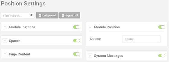
Some of these Position Particles are very straight-forward:
- Spacer: This separate content blocks.
- Page Content: This is the main content for a particular page.
- System Messages: These are the automatic messages produced by Joomla.
That leaves us with Module Instance and Module Position. Let’s switch to the Layout tab of the template to use them in action.
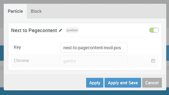
First, a Module Position:
- Drag a Module Position Particle to a place in your layout, say to the right of your Pagecontent.
- Cick the cog-icon
- Rename and edit the item:
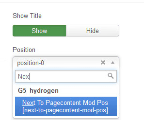
- Go the Joomla Module Manager and edit any module(s) in there.
- You can now assign it to the newly created Module Position location:
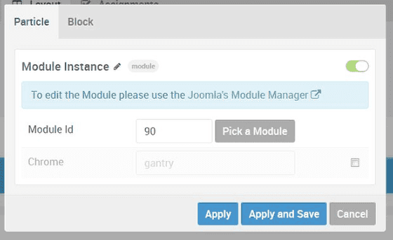
We also have the Module Instance Particle. You can think of this as being similar to the tag in Joomla, which allows you to insert a specific module directly within your Joomla articles.
Here's how to use the Module Instance Particle:
- Drag the Particle to a position in the layout.
- Click to edit the Particle.
- Select a published module. In the example below, we're using a module with an ID of 90:
#3. Atom Particles
Atoms are Particles of a special type. They are basically used for code. This can be your Google Analytics code, which has a custom Atom, or another line of custom Javascript or CSS code:
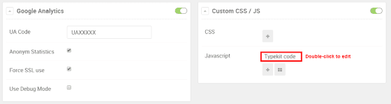
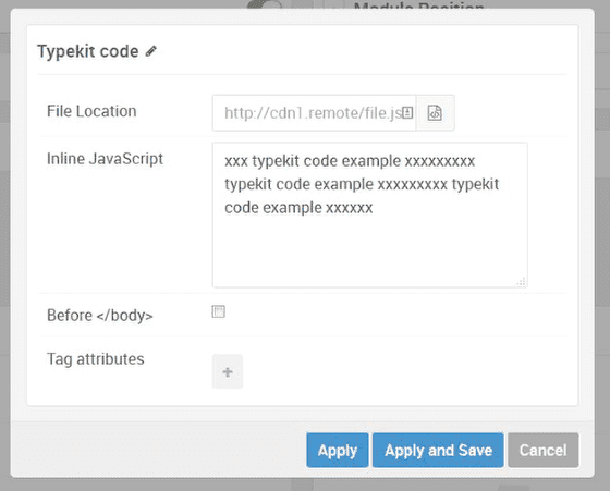
For Custom CSS / JS, doubleclick the item to edit it. You can then type in the code directly or a location where a file with the code is located (eiter inside or outside of the site):
By the way, Atoms will typically be valid for the entire site, so it best is usually to set these in Base – Outline. Make sure any Atoms you need are also placed in the Atoms section at the bottom of the layout tab.
Putting it all together to create your layout
Now that we know which items we can use and how to customize them, let's dig a bit deeper in the positioning of these elements.
You probably already noticed a few items in the Layout tab, some of which speak for themselves pretty much. Let’s take a random line, say the Footer. If you hover over a row, you see a number of new options showing:
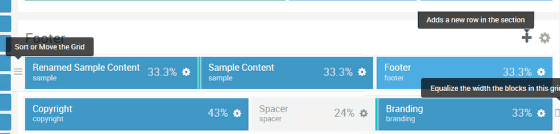
You can now see the following options:
- You see a Plus sign for adding full new rows within an existing section, such as the Footer or the Heading.
- To the left of each row, you see a Hamburger icon that you can hold and drag up or down to sort the rows within a section.
- You see the borders of the blocks in the row as green lines, indicating that you can click and hold them to draw the border to the left or right to create blocks of any size you want. While with other templates you are usually stuck with divisions of 12 or 16 to set your block-size, you can now create them as any size you want, even odd sizes as 9 /63 / 28 % instead of 3 blocks of 33.3 % or 50 / 25 /25. This is a very powerful feature in your layouts!
- If you made a mess, you can use the icon to the left of the row to evenly distribute your blocks again.
- If you click and hold a block, you can drop it in the Trashcan to completely delete it even.
Finally, for resizing, you can also edit an item, click the Block tab, and edit the width. Depending on the presence of other blocks in the row, the size may be restricted slightly:
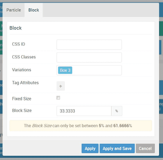
Also, like in the image above, you can set Variations, like Box 3, which usually corresponds with a pre-defined fill-color for the block (blue in this case).
Further possibilities are setting rows to Full-width or Boxed (row-settings) and setting Spacers to create some space in your designs.
I hope you enjoyed the middle post in this 5-part Gantry 5 series. In the fourth tutorial, I'll show you how to use the Menu settings in Gantry.