Bolt is professional template that we provide free to our training students. It's simple, fast and loads as fast as a lightning bolt (hence the name!)
Because Bolt is not a complex template it's a great place to start learning Joomla template design. This tutorial will show you how to modify the column widths in Bolt. Hopefully it will also give you a good example of one method for creating flexible layouts:
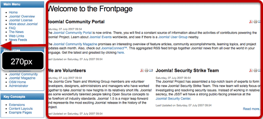
Default Three Column Layout
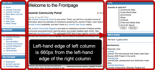
The first thing you should know is that the Bolt template is 960px wide. That's how much space we have to work with. By default, there are three elements taking up that space - the left column, center column and right column,. They are controlled by only four CSS elements.
First of all we have the left div. This div is straightforward and the most important element is the width:
#left {
 float:left;
 font-size:1.2em;
 overflow:hidden;
 width:160px;
 }
Next there is a second layer of CSS added to the left div. This only happens when there are three columns live on the site. The margin is 660px from the edge of the right column and actually controls the placement of left column. If this number were -770px then the left column would disappear off to the left-hand side of the site.
.threecolumns #left {
 margin:0 0 0 -660px;
 }
This is the CSS that controls the main body text. The left margin of 170px keeps the main body out of the way of the left column which is 160px wide.
.threecolumns #center {
 margin:0 10px 0 170px;
 width:480px;
 }
Finally we have the right column. This is even simpler than the left column - the main element is the width of 300px.
#right
 {
 float:left;
 font-size:1.2em;
 overflow:hidden;
 width:300px;
 }
Change the Right Column Width With Three Columns
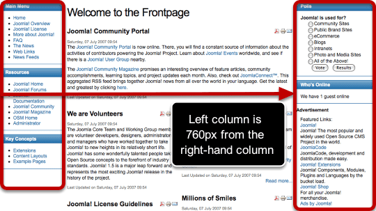
We're going to reduce the right column size so that it is only 200px wide rather than 300px. Here's what we need to change.
Remember that the left column position is definited by its margin from the right column. So if the right column shrinks, we need to increase the margin if we want the left column to stay in the same place. Because the right column is shrinking by 100px, we're going to increase the margin by 100px from 660px to 760px.
.threecolumns #left {
 margin:0 0 0 -760px;
 }
Also, we're going to allow the center of the site to take up the extra 100px so let's increase its width from 480px to 580px:
.threecolumns #center {
 margin:0 10px 0 170px;
 width:580px;
 }
Finally, we actually need to shrink the right column from 300px to 200px:
#right
 {
 float:left;
 font-size:1.2em;
 overflow:hidden;
 width:200px;
 }
Change the Left Column Width With Three Columns
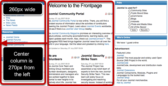
We're going to increase the left column size so that it is 260px wide rather than 160px. Here's what we need to change.
Remember that the left column position is definited by its margin from the right column. However, the controlling element is the left-hand side of the left column. That's not moving. Neither is the right column. So we can leave this part alone:
.threecolumns #left {
 margin:0 0 0 -660px;
 }
We do need to change the width of the left column. This is fairly simple: we just change 160px to 260px:
#left {
 float:left;
 font-size:1.2em;
 overflow:hidden;
 width:260px;
 }
We're going to take that extra 100px from the center of the site so let's decrease its width from 480px to 380px:
.threecolumns #center {
 margin:0 10px 0 270px;
 width:380px;
 }
Finally, we can leave the right column alone:
#right
 {
 float:left;
 font-size:1.2em;
 overflow:hidden;
 width:300px;
 }
Default Left Column Layout
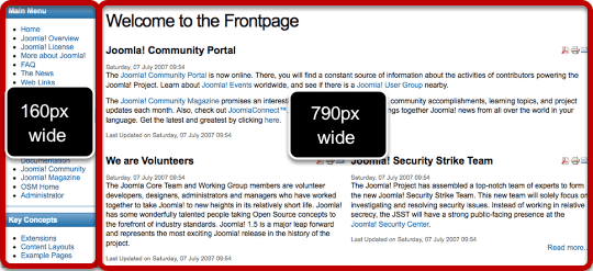
Whereas the three column layout can be tricky, the two column layouts are much more staightforward. We're just using simple widths for the two columns:
#left
 {
 float:left;
 font-size:1.2em;
 overflow:hidden;
 width:160px;
 }
.leftcolumn #center {
margin:0 0 0 170px;
width:790px;
}Changing the Left Column Width
We're going to increase the size of the left column by 100px so let's increase the width from 160px to 260px:
#left
 {
 float:left;
 font-size:1.2em;
 overflow:hidden;
 width:260px;
 }
For the center column we need to reduce the width from 790px to 690px in order to add that width to the left column. We also need to accomodate the left column by increasing the margin from 170px to 270px:
.leftcolumn #center {
 margin:0 0 0 270px;
 width:690px;
 }
Default Right Column Layout
Again, the two column layout is staightforward. We're just using simple widths for the two columns:
.rightcolumn #center
 {
 margin:0 10px 0 0;
 width:650px;
 }
#right
{
float:left;
font-size:1.2em;
overflow:hidden;
width:300px;
}Changing the Right Column Width
We're going to make the right column narrower by 100px. So in order to fill up that space, let's make the center column wider by 100px:
.rightcolumn #center
 {
 margin:0 10px 0 0;
 width:750px;
 }
Now let's remove 100px from the right column.
#right
 {
 float:left;
 font-size:1.2em;
 overflow:hidden;
 width:200px;
 }