
Ah, landing pages: the gateway between a browsing website visitor and an engaged contact. Despite the popularity of landing pages across the web, the concept of the form still puzzles many marketers.
What should you ask on a form? How many questions are too many? Is there a way to structure a form so it engages high quality leads?
If you're wondering questions like these, read on for insight.
A necessary evil
The unfortunate and unfavorable truth is that forms are annoying. Really, really annoying.
When someone clicks on a call-to-action about a free eBook, they expect to be taken to the free eBook. More often than not, the landing page is percieved as an interruption, with the form being an added hassle.
Don't worry, I'm on your side. Landing pages are essential mediums of communication, and forms provide invaluable information that transforms that visitor into a contact you can nurture.
The trick with both landing pages and forms is to make them as concise as possible, while still conveying your intended message and capturing the information you need about the soon-to-be contact. We're trying to avoid the feeling you get when filling out a form like the one in the image up and to the right!
But we all know there's a difference between a contact, and a contact that's a match for your business. Up until now, you may have thought you had no control over the kind of leads that come in. That doesn't have to be the case, if you're willing to put a little thought and energy into your forms.
By creating forms that are optimized for the user experience and ask the right kind of questions, you can ensure you're getting not only more leads, but higher quality ones to boot.
Are you ready to take a stab at creating your form? Here's what you need to consider:
Ask as few questions as possible
I know, this one's implied. But really, try this: once you've created your form, take a quick break. Go for a walk, text a friend, whatever. When you come back, give it a look over.
Are there any questions here that are unnecessary? Are you asking things you don't really need to know, just because you've grown accustomed to seeing them on other forms?
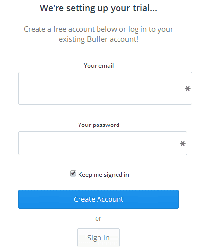
Nix anything that's not absolutely needed. Take a cue from Buffer, who does an awesome job getting to the point on their free trial form:
Wondering how to determine what is and isn't "necessary"? Let's talk about it.
Ask what you need to know to score the lead
Lead scoring is the process of assigning points to contacts that fulfil criteria that you deem to be valuable.
For example, let's say a small business owner fills out your form. He identitifes himself as the owner of a business with <20 employees, in Australia, looking for an agency to upgrade his Joomla site.
Depending on who your agency is targeting, each of these traits could trigger your CRM to give him a point for the characteristics that meet your persona criteria. Then, when the sales team is reviewing leads to reach out to, they can focus their efforts on those with the highest points, AKA the best fits for your company.
If you're unsure of what to ask besides a name and phone number, consider key indicators like these that will help you identify leads of greater priority.
Play with the layout
Not all forms are created equal. In addition to keeping your form as concise as possible, you'd be well suited to get creative with your format.
Rather than leaving all fields as text entry boxes, consider ways you can make the layout more engaging while also capturing information in a more streamlined manner for lead scoring. Try radio boxes, drop downs, changes in color, etc.
Remember to structure your questions in such a way that you'll be able to use the responses in your CRM. For example, if you plan to send a thank you email to new contacts addressing them with a name token or tag, be sure you're having them enter their first and last name separately.
If your form manager has testing capabilities, you can even create alternate versions of the same form and see which one performs higher.
Find your balance
Above, we determined that a shorter form is a better form. This is true about 99% of the time, but I've never been a fan of absolutes and I'm willing to admit to an exception.
If and when they type of lead you want is very specific, you may be better suited with a slightly longer form.
The longer your form, the less submissions it'll get. However, the submissions that you do get will come from people who are willing to put in the extra work to engage with your offer. And that's quite the valuable lead!
So yes, it's OK to ask a little more from time to time, assuming you're trying to capture information on a specific kind of person. Just don't take this as a license to go crazy and pop 50 questions in that bad boy.
Expand your original form with 2-3 more questions that will help you identify when that diamond in the rough lead comes through. Generally speaking, even your lengthiest forms should be under 8 questions.
Get personal
As with all other aspects of Inbound, your forms should be tailored around the goals and preferences of your persona. If you're a B2B software, the way your questions are worded will be unique from a more casual B2C form.
Consider these two forms - one for Eat 24 (a food delivery service), and one for Eloqua (a marketing software):
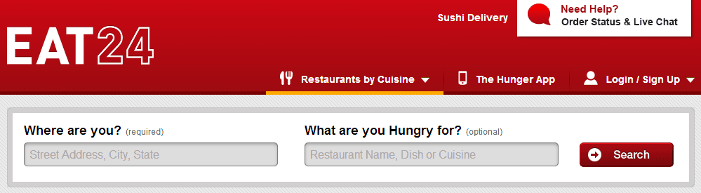
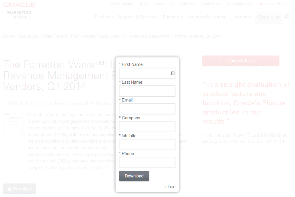
Do you notice how much different it feels when the form is personally asking "you"? Eat24's form feels directed right at me, while Eloqua's is about as generic as it can be.
Personalize forms whenever you have the opportunity to ensure the lead feels engaged with the copy.
Don't forget the submit button
By the time we get done with a form, the button may be the last thing we're worried about. After all, how much can it really matter what you write in that little box at the bottom of the form?
A lot. From color to copy, the submission button is the last chance you have to convert this visitor. If it's not engaging, if it's not nice to look at, if it's hard to find, you're going to cancel out all the hard work you did crafting the perfect form.
Look again at Eloqua's form above. The button says "Download", which is fitting for the action. But what if it said "Get Your Copy", or "Access the Report"? By changing up the message and making it a little more enticing, they could make it a lot more enticing.
Check out what Unbounce has done below - their button really pops visually from the rest of the form, it's detailed, and it's personalized. A plus!
Whether you've been using forms for ages or are just starting out in the landing pages/form realm, I hope these tips help you to start converting the kind of high quality leads we all hope for. If you have any other great form tips, or questions, feel free to shoot us a Tweet!