
Is your calendar showing as a Month grid on desktop,
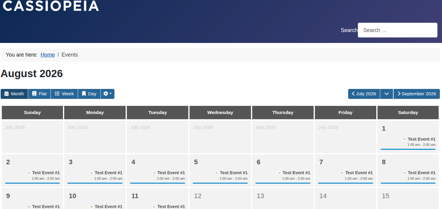
but switching to a List on mobile screens?
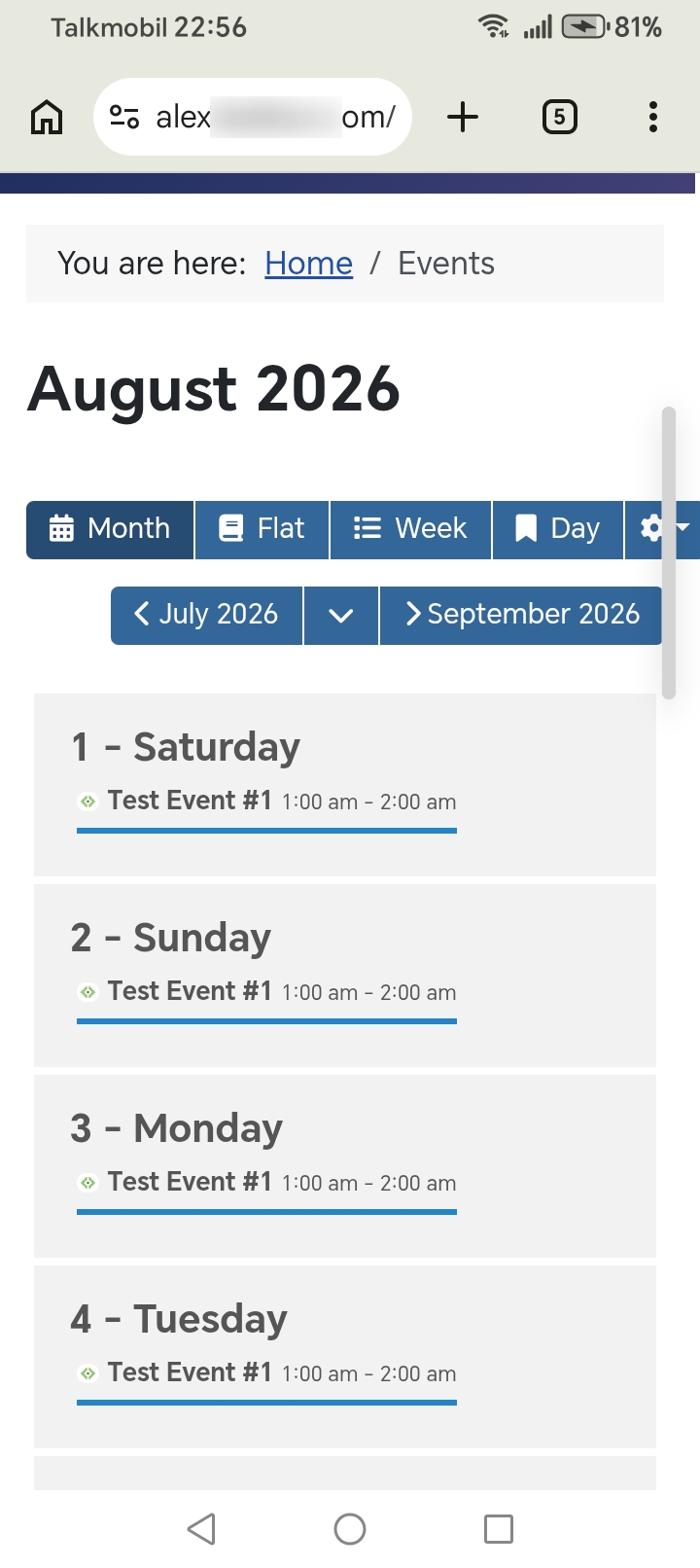
Don't worry, your site isn't broken!
Here is why this happens and how JCal Pro handles mobile screens.
Why the View Changes on Mobile
A month grid has 7 columns—one for each day of the week.
On a phone, 7 columns get squeezed into a tiny space. Event titles become impossible to read. Day boxes get too small to tap with a finger.
To fix this, JCal Pro changes its look on smaller screens. It swaps the grid for a clean, scrollable list. This keeps your calendar neat and easy to use on any phone.
Why Isn't There an Option to Change This?
This layout change happens automatically in the browser. It checks the visitor's screen width and adjusts the design instantly.
Because it works in the background, you won't find a "Theme" or "Mobile Option" setting in the admin area.
Can I Force the Month Grid on Mobile?
We strongly suggest sticking with the mobile list view. It gives your site visitors the best experience.
If you really need a custom layout, a web developer can adjust this for you. They can use CSS template overrides in your Joomla template to change how the calendar responds.