
A few years ago we wrote the Ultimate Mobile Joomla Guide. We discussed two different techniques for making your Joomla site ready for mobile phones. Both of those techniques worked by showing one template to desktops and another to mobile devices.
Since that post, a third option has emerged: responsive design. Responsive design means that your one and the only template is flexible enough to look good on any device.
In this blog post, we'll show you how two of the mobile-ready Joomlashack templates look on some mobile devices.
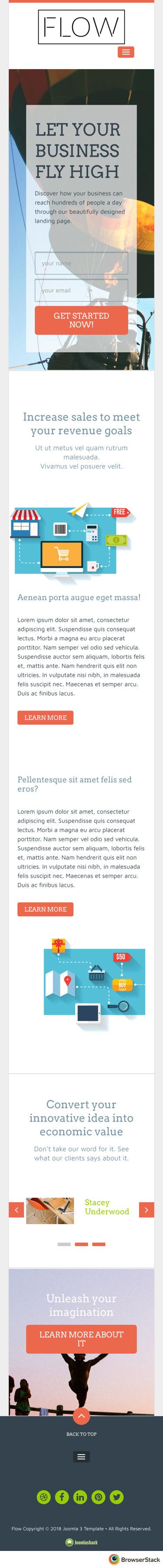
Template #1. Flow
Purpose: A Joomla Template for a business landing page.
- On iPhone:
- On iPad Mini 2:

- On iPad Air:

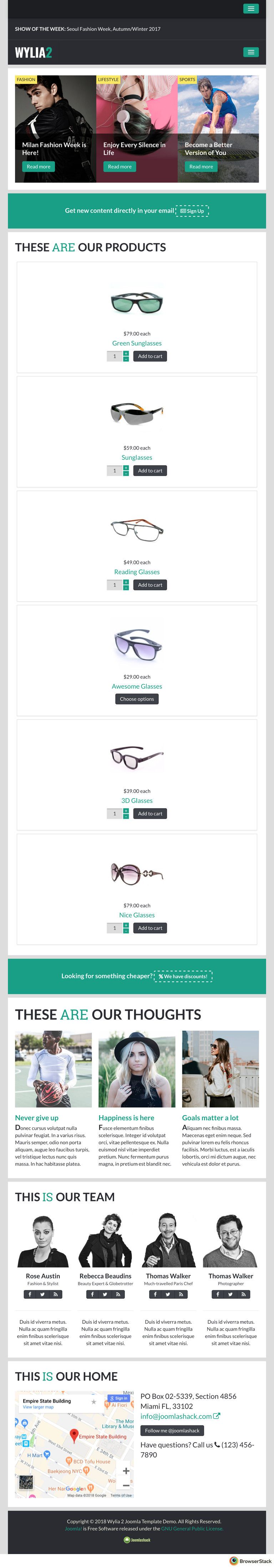
Template #2. Wylia
Purpose: A Joomla Template integrated with the HikaShop Joomla extension for an e-commerce site.
- On iPhone:

- On iPad Mini 2:
- On iPad Air:

What's Next?
What's Next?
Save $1,000's when you sign up for Joomlashack's Everything Club.
You will get your hands on our extensive range of over 20 extensions, plus legendary support!