It's hard to redesign your logo.
Last week, Slack announced a major redesign of their logo. It didn't take 5 minutes before people started saying, "I've seen that design before!"
Here is the Joomla logo and the new Slack logo, side-by-side:
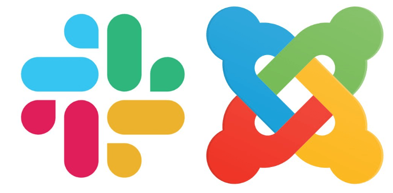
Yes, I did rotate the Joomla logo 90 degrees, but even without that change, the similarities are obvious. This post from Under Consideration has a great overview of Slack's redesign.
So, after seeing the reaction to Slack's relaunch, this seemed like a great time to talk about the difficulties we've had in redesigning the Joomlashack logo.
Why does Joomlashack need a new logo?
Here's the current Joomlashack logo, which hasn't changes in the last 13 years:

The logo is OK, but it does feel dated in 2019. The most common feedback we get about the logo is, "It looks like Clip Art". The feeling from people we ask is that it lacked personality. The logo looks like a generic icon, rather than an actual logo that's unique to one company.
The wordmark is also acceptable, but the font is cramped and doesn't match some of the more modern fonts we're using elsewhere on the site.
So a few months ago, we started to brainstorm new ideas to update Joomlashack's branding.
Attempts at a mascot
Our team started off by trying to create a mascot for Joomlashack. The idea was to create a warmer vibe on the site, aiming to make customers smile. You've probably seen the monkey mascot at MailChimp. Closer to Joomla, Peter from RegularLabs does an excellent job of using himself as a mascot. We've also had good luck with mascots in other businesses we run: the purple penguins at PublishPress have been a big hit.
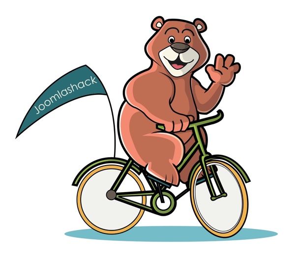
We looked for mascots that would fit well with the "shack" part of "Joomlashack", but perhaps we were being too literal. Here's an early proposal for a Joomlashack bear. After all, bears can live in shacks, right? The bear idea ended up being too complex, particularly when we added a bike.
Our next serious attempt was a bird mascot. We worked on several birds, eventually focusing on a cockatiel / cockatoo. This was closer to what we wanted, but it ended up looking too much like a sports mascot.

Attempts at a logo
After a few weeks, we felt like we weren't having much luck with the mascot. So we decided to turn our attention to redesigning the logo.
Again, the "shack" concept was key. We also planned to add a "J" to make the logo more unique and Joomlashack-specific. Here are some of the early proposals that we were playing around with. None of these were good enough to break away from the "Clip Art" criticism.

Next, we worked towards a more complex design. This was my clear second favorite. I particularly liked how the arm of the "J" extended up to look like a chimney. That helped add to the house / shack feel of the design. However, overall our team didn't like this approach.

Finally, one variation started to win out in our discussions. This version struck a nice balance, being simple but also unique. It references a "shack" and a "J" without those elements being too strong.

Color issues
A few years ago, Joomlashack underwent a much more comprehensive overhaul than the one we're attempting now. You can see many of the graphics here.
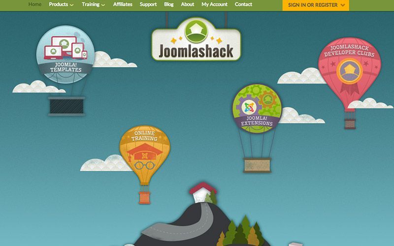
After taking over Joomlashack, we found that design was beautiful, but also over-elaborate and hard to maintain. We've taken steps to simplify this site's appearance with less ornate fonts and graphics.
However, that design introduced a Joomlashack color palette that we're still using now:
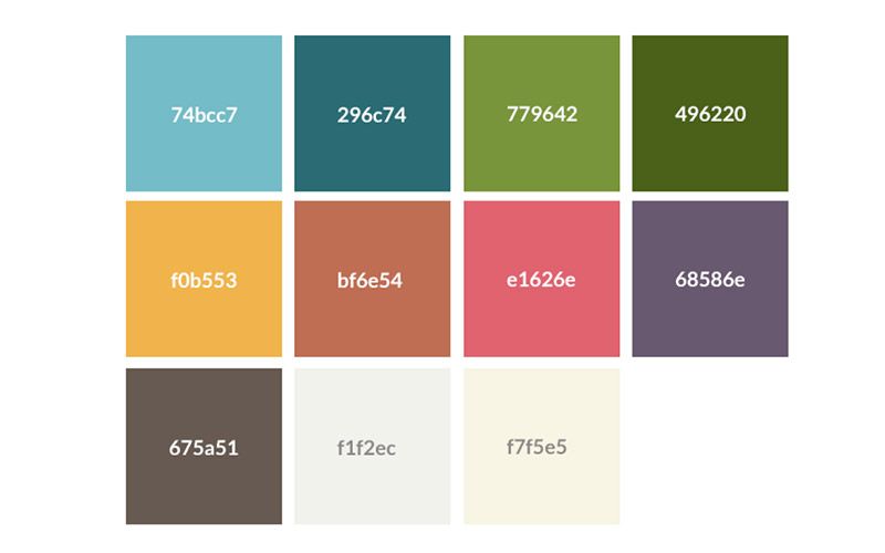
Unfortunately, using those colors looked washed out and pale in the new logo. This next image shows the old colors on the left and a new color palette on the right. The wordmark is using the Roboto font.

We realized that to update the logo, we'd also need to update our site's color scheme.
Over to you ...
Going through this process reminded me again of how hard it is to update your business branding. We found it hard with tens of thousands of users. I can only imagine how hard Slack found it with tens of millions of users!
Here's where we are with the new logo:

We hope this redesign is more modern and memorable. But, we place an incredibly high value on what our users think. So this final step in the rebranding process is to show you our ideas and walk through the process.
We'd love to hear from you:
- Does this new design feel like an improvement? Could it be improved?
- Have you updated your branding lately? Feel free to share your examples and processes.
Update
A huge thank you to everyone for your feedback. You are awesome. I'm amazed how helpful and constructive people can be.
Becase of your feedback, we went back and kept working on this design process. It took another 2 months, but we finally agreed on a new Joomlashack logo. The logo is based on the "clear second favorite" you can see above. The text is Source Sans Pro, as opposed to Roboto which no-one seemed to like!


