
Welcome to the 11th tutorial in our series on the CSS Grid.
We are presenting this series to help Joomla developers learn about CSS Grid. The introduction of CSS Grid will be one of the major changes in upcoming Joomla 4.
In past tutorials, you learned how to place items on a grid using the span keyword and/or using a line-based placement.
There’s another method for placing items on a grid. You can create areas inside the grid with your own specific names and then position the items
The grid-template-areas property allows you to describe how the layout looks like. Then with the grid-area property, you will be able to place those items on the areas you’ve defined.
You will learn about these properties in this tutorial. Let’s start!
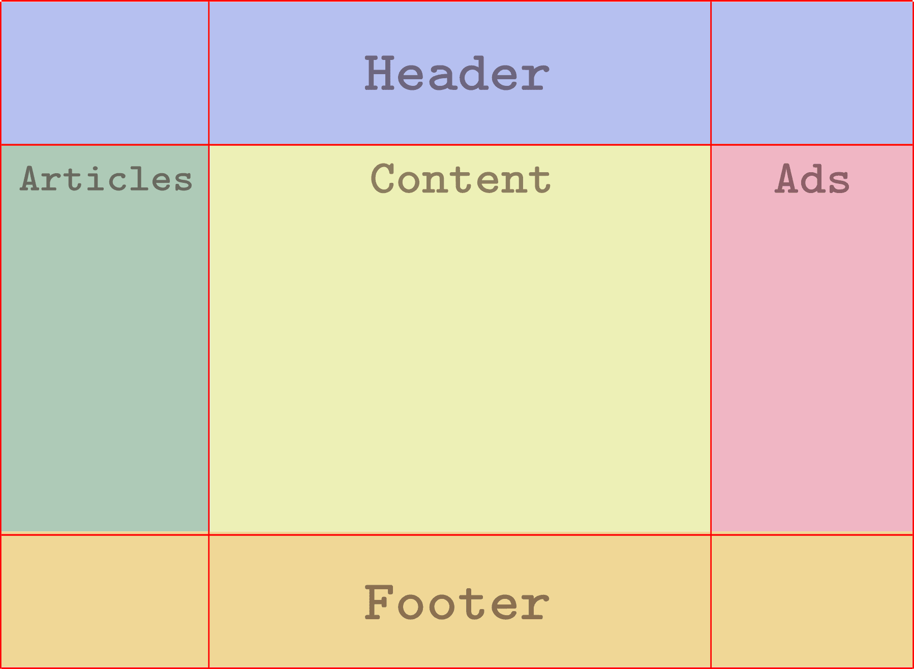
Step #1. The Layout
You are going to build a simple layout with a header, a content section, a footer, and two sidebars. The grid will be divided into 3 columns and 3 rows as you can see in the following diagram:
Step #2. Create the HTML
- Open your preferred code editor.
- Create an HTML file and paste the following code:
<div class="container">
       <div class="item header">Header</div>
       <div class="item content">Content</div>
       <div class="item articles">Articles</div>
       <div class="item footer">Footer</div>
       <div class="item ads">Ads</div>
   </div>
As you already know, the source order of the markup is not relevant to the layout, because the placement of the items will be achieved through CSS.
Step #3. Create the CSS
- Create a CSS file and link it to your HTML file.
- Add the following global styles:
/* GLOBAL STYLES */

   * {
       box-sizing: border-box;
       }
   body {
   background-color: #AAA;
   margin: 0px 50px 50px;
}

   /* Each item in the grid contains numbers */
   .item {
   /* Center the contents of the grid items. Making each grid item a Flex Container */
   display: flex;

   /* Horizontal and Vertical centering */
   justify-content: center;
   align-items: center;
   border: 5px solid #87b5ff;
   border-radius: 3px;
   font-size: 2em;
   font-family: sans-serif;
   font-weight: bold;
   background-color: #1c57b5
}
Step #4. Create the CSS Grid
We need a grid with 3 columns for the sidebars and content area and 3 rows for the header, main and footer containers.
/*CSS Grid styles */
   .container {
       display: grid;
       grid-template-columns: 3fr 5fr 3fr;
       grid-template-rows: auto auto auto;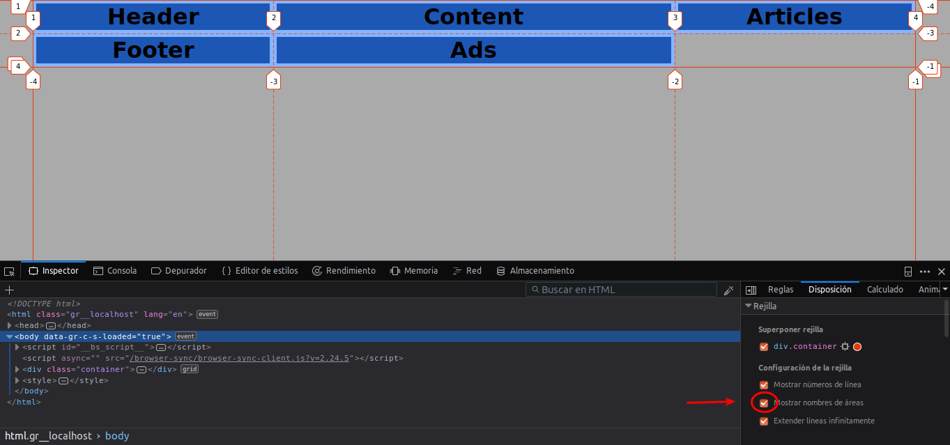
}- Turn on the Grid inspector and make sure you check the Show area names option.
Step #5. Define the Grid Areas
It’s time now to define the areas within the grid in order to place items inside these.
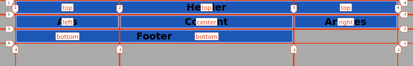
Take a look at each cell in the mockup once again. As you can see, there are 9 cells in a 3x3 grid. We’re going to assign each one of these cells to an area with the grid-template-areas property.
- Let’s edit the CSS code:
.container {
   display: grid;
   grid-template-columns: 3fr 5fr 3fr;
   grid-template-rows: auto auto auto;
   grid-template-areas:
       "top top top"
       "left center right"
       "bottom bottom bottom";
}
The grid-template-areas property describes what the layout looks like in an easy to understand notation. You take each one of the cells per row in a grid and assign area names to them.
Notice that there are no commas separating the area names or at the end of each quoted row. There’s a semicolon at the end of the declaration like usual in CSS. You can use whatever name you want to define these areas.
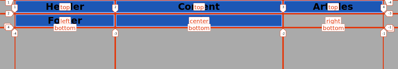
You can now see the names of the areas you’ve defined inside the grid. Time to map (assign) grid items to these areas.
Step #6. Assign Items to the Grid Areas
- Edit the CSS code:
.header {
   grid-area: top;
}
.content {
    grid-area: center;
}

.articles {
    grid-area: right;
}
.footer {
    grid-area: bottom;
}

.ads {
   grid-area: left;
}
You’ve just placed each of the items inside the grid to the regions (template areas) you’ve defined. Take a look at the browser.
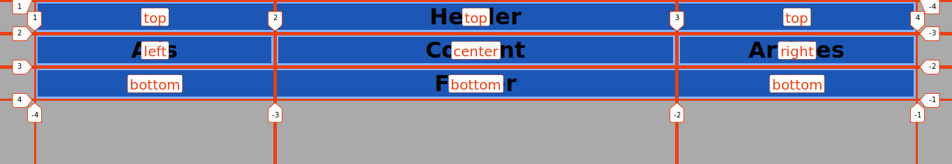
As you can see, the browser shows the area names you’ve created and the grid items are nicely placed according to the template.
But what if you want to leave a blank space? For example, what if you don’t want to assign a grid area to a particular cell at all? Just use a period:
.container {
   display: grid;
   grid-template-columns: 3fr 5fr 3fr;
   grid-template-rows: auto auto auto;
   grid-template-areas:
       "top top top"
       "left center right"
       "bottom bottom .";
}
Don’t forget the period! The grid-template-areas property has to take each cell into account, otherwise, you’ll break the layout.
Step #7. Working with Media Queries
Now that you’ve assigned each one of the items to their respective areas, you only have to edit the grid-template-areas property to match the layout you want to the screen size of every device.
- Add a media query to the CSS code:
/* Media Queries */ @media (min-width: 768px) and (max-width: 1024px) and (orientation: landscape) { .container { grid-template-areas: "left top top" "left center center" "bottom bottom right"; } }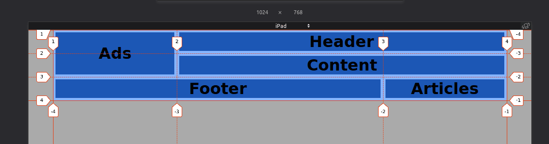
Time for you to practice! Build your own layout with the grid-template-areas property and create a couple media queries to position elements inside those areas, changing the layout for each one of the device screen sizes.
Thanks for reading!
The previous 10 posts in this series:
- CSS Grid #1: Everything Joomla users need to get started with CSS Grid
- CSS Grid #2: How to Use the Firefox Grid Inspector with CSS Grid
- CSS Grid #3: Understanding Explicit and Implicit Grids in CSS Grid
- CSS Grid #4: How to Use the Autoflow Property in CSS Grid
- CSS Grid #5: Determining the Size of the Tracks in CSS Grid
- CSS Grid #6: The Auto Keyword and Repeat Notation in CSS Grid
- CSS Grid #7: How to Size Grid Items with the Span Keyword in CSS Grid
- CSS Grid #8: How to Use Line Placing in CSS Grid
- CSS Grid #9: How to Layer Items Inside a CSS Grid
- CSS Grid #10: How to Name Grid Lines
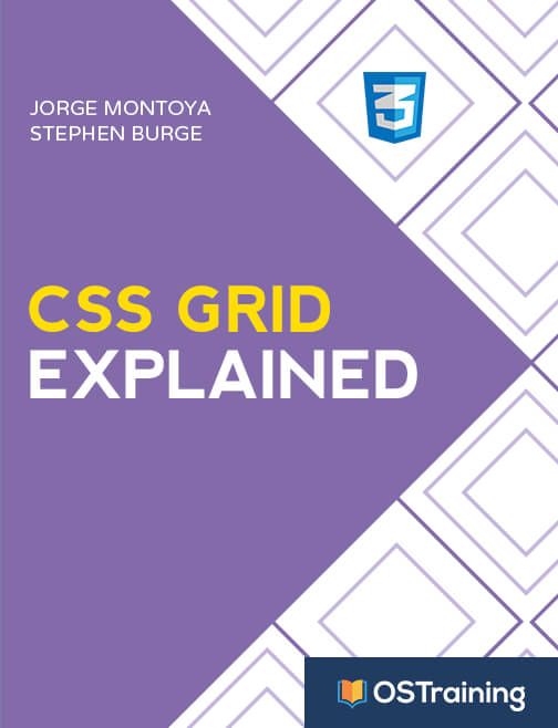
Get our CSS Grid Explained Book
All Joomlashack Pro members get access to our "CSS Grid Explained" book. All you need to do is sign up for a Joomlashack extension, template or training membership.
In this short book, you are going to master the key ideas behind CSS Grid. This book is in the best traditions of OSTraining. There are no long-dense paragraphs of theory. You pick up the book and you start writing code immediately.
In the first chapter, we start with the basic terminology. You'll learn the difference between Grid Areas and Grid Cells, between Grid Tracks and Grid Gaps.
Then, using a hands-on approach, you'll start building CSS Grids. There are 9 different exercises in this book. You'll build everything from the most basic CSS Grid to a full site layout.
About the author