
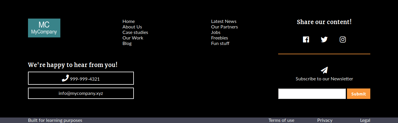
In this tutorial, you are going to build a footer element with media queries. The main part of the footer contains 6 elements on a wide screen.
This layout works with screens larger than 960px.
The 6 elements are as follows:
- The logo.
- The primary navigation.
- The secondary navigation.
- The social media block.
- The contact block (phone number and email address).
- The submit form for the newsletter subscription.
There is an additional element at the bottom. This bottom line has some descriptive information and the usual links to the legal stuff of the company.
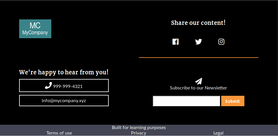
Between 768px and 960px, the footer turns itself into a 2x2 grid, the two navigation elements disappear.
The layout of the bottom line has also changed. Now it is a grid with one column and two rows.
When the screen is less than 768px, the footer keeps all elements, but they are all aligned in one single column

Let’s start!
Step #1. - The HTML
- Download this file.
- Open this file in your preferred code editor.
Notice that the links to the Google Fonts and Font Awesome libraries are included in the head tag of your HTML code. The link to the phone call in the contact-block section has the tel: attribute, which allows you to dial the number directly from your site when tapping the button on your smartphone.
There are two first-level div containers:
- The
footer. - The
bottom-line.
The footer element has a child div called footer-container, which will be the grid container.

Step #2. - The Basic CSS Styles
- Create a file called style.css.
- Copy and paste the following basic styles:
/* BASIC STYLES */ * { padding: 0; margin: 0; } li { list-style-type: none; } a { text-decoration: none; } body { font-family: 'Lato', sans-serif; } h1, h2, h3, h4, h5, h6 { font-family: 'Merriweather', serif; } .footer { color: #fff; background: #000; padding: 4em 0; }
Step #3. - The CSS Grid Styles
The first element you need to target, is the footer container. It has 3 columns and 2 rows. The first and last columns are meant to serve as margins of the layout.
- Edit the CSS code:
.footer { display: grid; grid-template-columns: 7vw 1fr 7vw; grid-template-rows: auto auto; }After that, you have to target the footer-container element, which contains all other footer “blocks”, and place it between the second and third column lines.
- Edit the CSS code:
.footer-container { grid-column: 2 / 3; }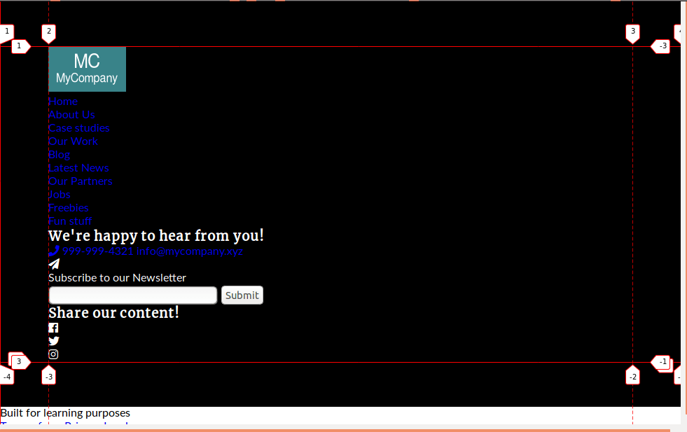
The footer-container is a nested grid with 4 columns and 2 rows. The layout will be built using the grid-template-areas property, in order to define the areas, where the content will be assigned to.
- Edit the CSS code:
.footer-container { grid-column: 2 / 3; display: grid; /* ACTING AS A GRID CONTAINER */ grid-template-columns: 2fr 2fr 2fr 3fr; grid-template-rows: auto auto; grid-template-areas: "logo navigation secondary social" "contact contact . newsletter"; }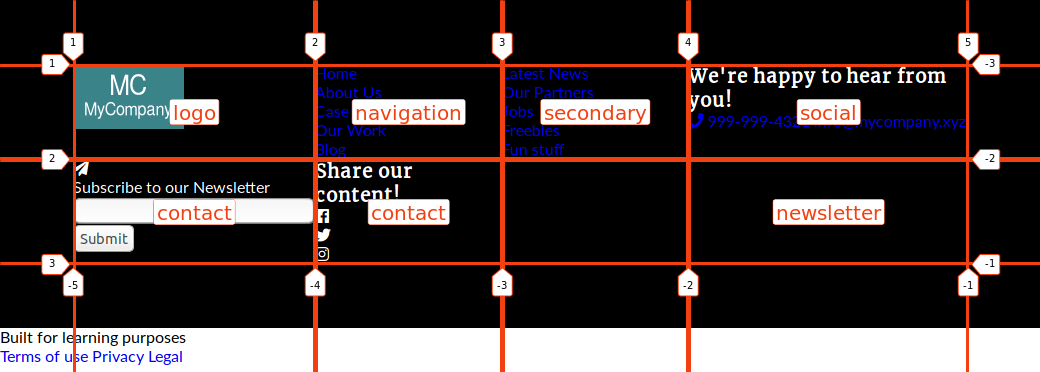
Once the areas are defined, you have to assign each element to its respective area.
- Edit the CSS code:
.footer-logo { grid-area: logo; } .footer-nav { grid-area: navigation; justify-self: center; } .footer-secondary-nav { grid-area: secondary; justify-self: center; } .social-networks { grid-area: social; } .contact-block { grid-area: contact; } .newsletter { grid-area: newsletter; }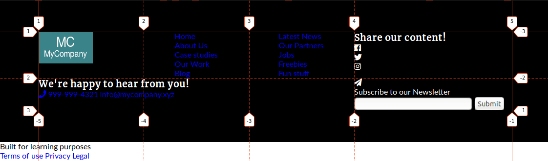
Notice that you have horizontally centered the two navigation elements with the justify-self property.
The social-networks element is a 2x3 nested grid. Place the title and social media icons on their corresponding spot on the grid.
- Edit the CSS code:
.social-networks { grid-area: social; display: grid; /* ACTING AS A GRID CONTAINER */ grid-template-columns: repeat(3, 1fr); grid-template-rows: auto auto; justify-items: center; } .social-networks h3 { grid-column: 1 / -1; } .facebook { justify-self: right; } .instagram { justify-self: left; }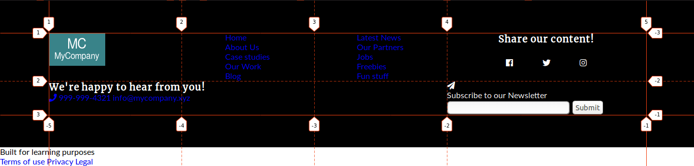
Place the contact-block and newsletter elements to the bottom of their areas, so both line up.
- Edit the CSS code:
.contact-block, .newsletter { align-self: end; }Now it is time to target the bottom-line container. You have to align it with the footer-container contents.
- Edit the CSS code:
.bottom-line { display: grid; grid-template-columns: 7vw 8fr 4fr 7vw; }Place the descriptive text on the second column of the grid.
- Edit the CSS code:
.bottom-line p { grid-column: 2; }
The legal container with 3 links is also a 3 column nested grid. The 3 items are justified to the right.
- Edit the CSS code:
.legal { display: grid; grid-template-columns: repeat(3, 1fr); justify-items: end; }You have all the grid styles in place. Let’s take a look at other cosmetic styles!
Step #4. - Other Styles
There are a couple of styles that you have to add in order to polish the design. Center the text in the newsletter section, adjust the height and the look of the input elements and the icons.
- Edit the CSS code:
.newsletter-text, .text-input { text-align: center; } .text-input input { border-radius: 0; } .text-input input:first-child { height: 2rem; } .text-input input:last-child { height: 2.25rem; color: #fff; border: none; background-color: #f99639; width: 5rem; font-weight: bold; } .fas, .fab { font-size: 1.5rem; } .newsletter-text icon, .newsletter-text p { margin: 0 0 1.1rem; } .newsletter-text p { line-height: 2rem; }
Change the color of all links, wrap the contact phone and email address in a “button like” border and center both texts. Give the social-networks container a border at the bottom. That way there will be a clear separation between the social-networks and newsletter sections.
.footer a { color: #fff; } .contact-block a { display: block; border: 2px solid #fff; padding: 0.5rem; margin: 10px 0 0; text-align: center; width: 70%; } .contact-block a:hover { border: 2px solid #f99639; color: #f99639; } .social-networks { border-bottom: 2px solid #f99639; }There are only the background and text color of the bottom-line left to style.
- Edit the CSS code:
.bottom-line { background-color: #444554; } .bottom-line, .bottom-line a { color: #fff; }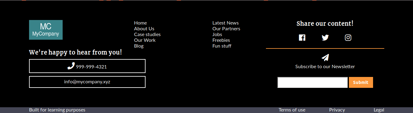
Step #5. - The Media Queries
The height of the footer on wide screens has to be increased a little bit, in order to create some “white” (free) space.
- Edit the CSS code:
/* MEDIA QUERIES */ @media screen and (min-width: 960px) { .footer { height: 45vh; } }On a big tablet screen (768px - 960px), the two navigation elements disappear and the footer-container element turns into a 2x2 grid.
You don’t have to assign elements to a grid area, since they are already assigned. Define the order of each grid-template-area, according to the layout.
The rows of the grid have an explicit height. The bottom-line element turns into a grid, in order to place its children on two different rows.
- Edit the CSS code:
@media screen and (max-width: 960px) { .footer-nav, .footer-secondary-nav { display: none; } .footer-container { grid-template-columns: 1fr 1fr; grid-template-rows: 20vh 25vh; grid-template-areas: "logo social" "contact newsletter"; } .bottom-line { display: grid; grid-template-columns: 7vw 1fr 7vw; } .bottom-line p { justify-self: center; } .legal { grid-column: 2 / -2; justify-items: center; } }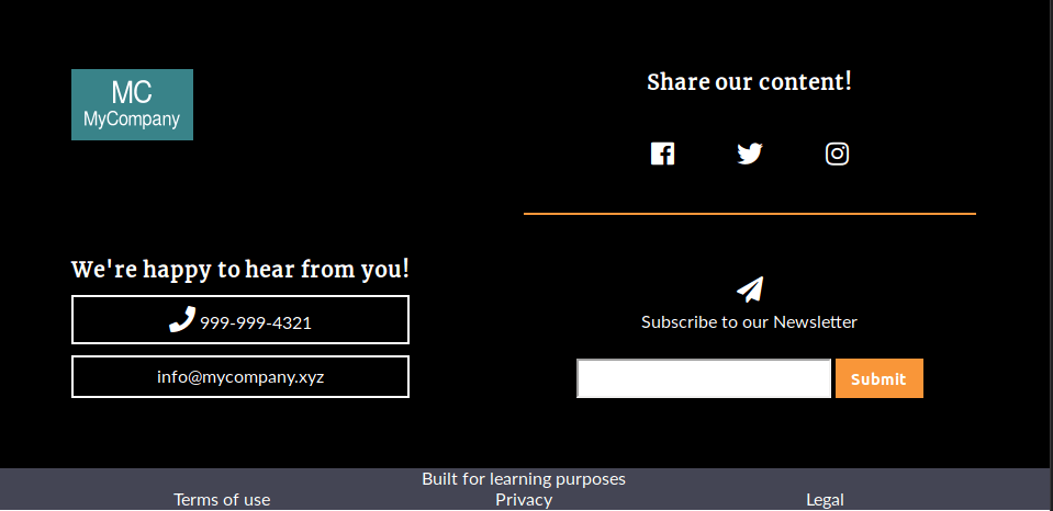
The footer-container element in the mobile layout (less than 768px) has only one column. Each grid item is centered on the inline axis. Moreover, the order of the elements in the design does not concur with the order of the markup. You can achieve this, by changing the order of the declared grid-template-areas. There are additional styles to obtain spacing between elements.
- Edit the CSS code:
@media screen and (max-width: 768px) { .footer-container { grid-template-columns: 1fr; grid-template-areas: "logo" "social" "newsletter" "contact"; } .footer-logo, .contact-block { justify-self: center; align-self: center; } .social-networks, .newsletter { padding: 3rem 0; } .contact-block a, .contact-block p { margin: 0 auto; } .contact-block h3, .social-networks h3 { line-height: 3rem; } }Congratulations! This tutorial has helped you to build a totally responsive footer with CSS Grid. Leave us your comments and feedback below.
Thanks for reading!
The previous 21 posts in this series:
- CSS Grid #1: Everything Joomla users need to get started with CSS Grid
- CSS Grid #2: How to Use the Firefox Grid Inspector with CSS Grid
- CSS Grid #3: Understanding Explicit and Implicit Grids in CSS Grid
- CSS Grid #4: How to Use the Autoflow Property in CSS Grid
- CSS Grid #5: Determining the Size of the Tracks in CSS Grid
- CSS Grid #6: The Auto Keyword and Repeat Notation in CSS Grid
- CSS Grid #7: How to Size Grid Items with the Span Keyword in CSS Grid
- CSS Grid #8: How to Use Line Placing in CSS Grid
- CSS Grid #9: How to Layer Items Inside a CSS Grid
- CSS Grid #10: How to Name Grid Lines
- CSS Grid #11: How to Place Items with Grid Template Areas
- CSS Grid #12: The minmax() Function
- CSS Grid #13: The auto-fill and auto-fit Keywords in CSS Grid
- CSS Grid #14: Centering and Aligning Items in CSS Grid
- CSS Grid #15. The justify-content and align-content Properties
- CSS Grid #16. The grid-auto-flow: dense Property
- CSS Grid #17. Nesting Grids
- CSS Grid #18: How to Build a Dropdown Menu
- CSS Grid #19: Difference Between Grid Containers and Block Containers
- CSS Grid #20: Build a Teaser Gallery with Cards
- CSS Grid #21: How to Insert an Empty Row in CSS Grid
Get our CSS Grid Explained Book
All Joomlashack Pro members get access to our "CSS Grid Explained" book. All you need to do is sign up for a Joomlashack extension, template or training membership.
In this short book, you are going to master the key ideas behind CSS Grid. This book is in the best traditions of OSTraining. There are no long-dense paragraphs of theory. You pick up the book and you start writing code immediately.
In the first chapter, we start with the basic terminology. You'll learn the difference between Grid Areas and Grid Cells, between Grid Tracks and Grid Gaps.
Then, using a hands-on approach, you'll start building CSS Grids. There are 9 different exercises in this book. You'll build everything from the most basic CSS Grid to a full site layout.
About the author