
Until now, in this series we have assumed that grid containers behave the same as block containers. But there are some subtle differences between them.
Being aware of those, will help you improve your development workflow. This tutorial will explain the differences between the Grid containers and regular block containers.
#1. Grid Containers with Floated Siblings
- Open your preferred code editor, create an HTML file and paste the following code:
<body>
  <div class="first-container item">
    <p>This is the first container and it is floated!</p>
  </div>
  <div class="second-container item">
    <p>This is a block container. It "slides" under its floated sibling</p>
   </div>
   <div class="third-container item">
    <p>This is the third container</p>
   </div>
</body>- Now create a CSS file, link it in your HTML file and paste the following styles:
/* GLOBAL STYLES */ * {
box-sizing: border-box;
}

body {
background-color: #AAA;
} .item {
border: 5px solid #87b5ff;
border-radius: 3px;
font-size: 1em;
font-family: sans-serif;
font-weight: bold;
background-color: #1c57b5;
}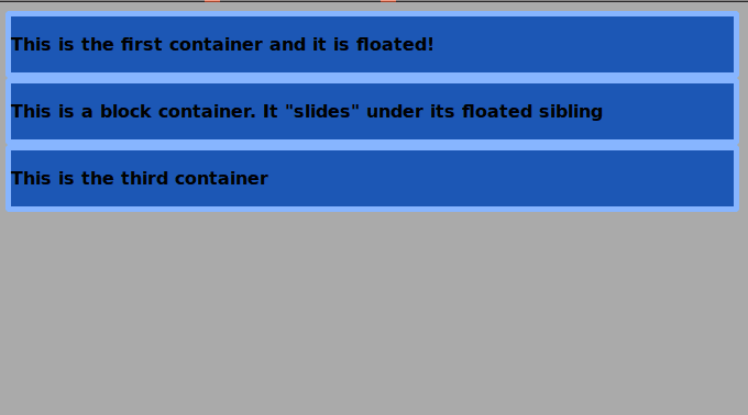
- Edit the CSS code, in order to float the first container:
.first-container {
float: left;
}
The normal behavior is that block containers “slide” under the floated container if they come after this floated element in the source order and they are all within the same parent container (in this case body). Apply some additional styles to test this.
- Edit the CSS code:
.first-container {
float: left;
margin-left: 30px;
height: 200px;
background-color: #fafa44;
}
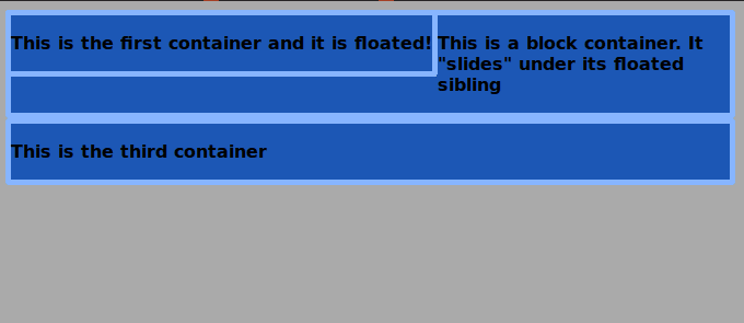
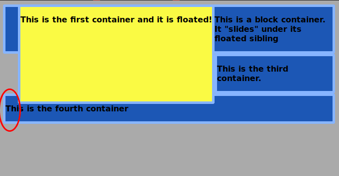
As you can see, the third container “slides” under its floated sibling too. This would continue until you close the containing div, or clear the float. Let’s take a look at what would happen if the third container was not a block container but a grid container.
- Edit the CSS code:
.third-container {
display: grid;
}
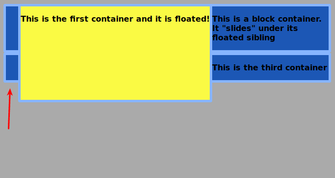
The grid container does not “slide” under the floated element, because it is a grid. It starts right where the floated container ends. However, the float is not cleared. Add a fourth container to the markup, in order to test this.
- Edit the HTML code:
 <body>
  <div class="first-container item">
   <p>This is the first container and it is floated!</p>
  </div>
  <div class="second-container item">
   <p>This is a block container. It "slides" under its floated sibling</p>
  </div>
  <div class="third-container item">
   <p>This is the third container.</p>
  </div>
  <div class="fourth-container item">
   <p>This is the fourth container</p>
  </div>
</body>
The fourth container will slide under the floated element.
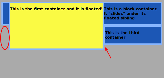
In order to prevent this, you have to clear the float within the grid container.
- Edit the CSS code:
.third-container {
display: grid;
clear:left;
}
This is what happens when you float block siblings of a grid container. It’s important to know how this works, however, it does not make much sense to float elements when you can lay everything out with Grid.
Notice also, that it is not possible to float grid items, but you can float Grid containers if you want.
#2. Grid Containers Do Not Have Collapsing Margins
There are 3 basic rules regarding collapsing margins for block containers in a block formatting context, none of them apply inside a Grid formatting context:
- The margin-bottom value of a block will collapse with the margin-top value of its next (adjacent) sibling and the highest value will prevail. This is also true, when there is a grid container after, before, or between block containers.
- If you set a margin-top value for a block container and a margin-top value for its first descendant, those margins will collapse and the highest value will prevail. The same occurs with the values for the margin-bottom property in the case of the last descendant and its block container. This happens only when there is no border, padding, float, clearance or inline element between the child elements and their parent.
- The margin-top and margin-bottom values of an empty container will collapse to 0.
We will not make a demonstration of rule 3, since creating an empty grid container and applying top and bottom margins to it will only generate a blank space with a height of both margins combined. In a Grid context, this can be achieved through the use of the grid-gap property.
Let’s take a look at rules 1 and 2!
- Open your preferred code editor, create a HTML file and paste the following code:
<div class="container">
  <div class="first item">
   <p>First Lorem ipsum dolor sit, amet consectetur adipisicing elit. Repellat, reprehenderit reiciendis pariatur natus officiis repudiandae?</p>
  </div>
  <div class="second item">
   <p>Second Lorem ipsum dolor sit, amet consectetur adipisicing elit. Repellat, reprehenderit reiciendis pariatur natus officiis repudiandae?</p>
  </div>
</div>- Create a CSS file, link it in your HTML file and paste the following styles:
/* GLOBAL STYLES */
* {
box-sizing: border-box;
margin:0;
}
body {
background-color: #AAA;
}
.item {
font-size: 1em;
font-family: sans-serif;
font-weight: bold;
background-color: #1c57b5;
}
Add margin-top and margin-bottom to the container.
- Edit the CSS code:
.container {
margin-top: 35px;
margin-bottom: 35px;
}
Now add margins to the top and bottom of the first and second descendants.
- Edit the CSS code:
.first,
.second {
margin: 20px 0;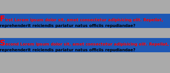
}- Open the web inspector of your browser and take a look at the box model for the container
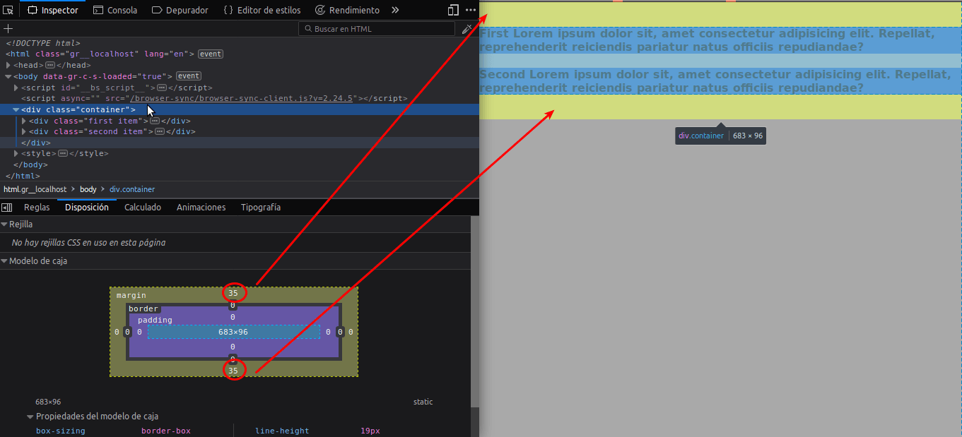
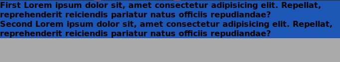
The top margin of the first element collapsed with the top margin of its parent container. In the same manner, the bottom margin of the second element collapsed with the bottom margin of its parent container. Furthermore, the margins of the sibling elements collapsed (to 20px) too.
In order to test the difference, you have to convert the block container into a Grid container.
- Edit the CSS code:
.container {
margin-top: 35px;
margin-bottom: 35px;
display: grid;
}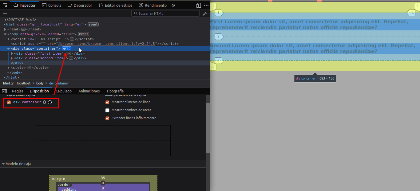
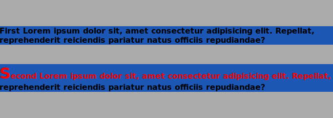
Take a look at the web inspector of your browser. No margin has collapsed between the grid container and its children or between siblings.
#3. Multi-column Layout is not Supported in Grid Containers
Multi-column Layout is a CSS module that allows designing in multiple columns just like a newspaper. The Grid is a bidimensional layout system that allows the use of columns and rows. By now, you already have realized why the use of multi-columns is unnecessary. None of these properties will work inside a Grid formatting context:
- column-count
- column-gap
- column-rule
- column-rule-color
- column-rule-style
- column-rule-width
- column-span
- column-width
#4. The ::first-line and ::first-letter Pseudo-elements are not Supported in Grid
- Add this code to the CSS file:
.item p::first-line {
color: red;
} .item p::first-letter {
font-size: 2em;
}
Now let's turn the <p> element inside the first item into a grid container.
- Edit the CSS code:
.first p {
display: grid;
}
This was a brief description of some of the most relevant differences between the grid and block containers. I hope you liked this reading. Thanks!
The previous 18 posts in this series:
- CSS Grid #1: Everything Joomla users need to get started with CSS Grid
- CSS Grid #2: How to Use the Firefox Grid Inspector with CSS Grid
- CSS Grid #3: Understanding Explicit and Implicit Grids in CSS Grid
- CSS Grid #4: How to Use the Autoflow Property in CSS Grid
- CSS Grid #5: Determining the Size of the Tracks in CSS Grid
- CSS Grid #6: The Auto Keyword and Repeat Notation in CSS Grid
- CSS Grid #7: How to Size Grid Items with the Span Keyword in CSS Grid
- CSS Grid #8: How to Use Line Placing in CSS Grid
- CSS Grid #9: How to Layer Items Inside a CSS Grid
- CSS Grid #10: How to Name Grid Lines
- CSS Grid #11: How to Place Items with Grid Template Areas
- CSS Grid #12: The minmax() Function
- CSS Grid #13: The auto-fill and auto-fit Keywords in CSS Grid
- CSS Grid #14: Centering and Aligning Items in CSS Grid
- CSS Grid #15. The justify-content and align-content Properties
- CSS Grid #16. The grid-auto-flow: dense Property
- CSS Grid #17. Nesting Grids
- CSS Grid #18: How to Build a Dropdown Menu
Get our CSS Grid Explained Book
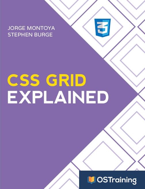
All Joomlashack Pro members get access to our "CSS Grid Explained" book. All you need to do is sign up for a Joomlashack extension, template or training membership.
In this short book, you are going to master the key ideas behind CSS Grid. This book is in the best traditions of OSTraining. There are no long-dense paragraphs of theory. You pick up the book and you start writing code immediately.
In the first chapter, we start with the basic terminology. You'll learn the difference between Grid Areas and Grid Cells, between Grid Tracks and Grid Gaps.
Then, using a hands-on approach, you'll start building CSS Grids. There are 9 different exercises in this book. You'll build everything from the most basic CSS Grid to a full site layout.
About the author