Joomla 4 is currently in development. It may be months before Joomla 4 is released, but we're already working on compatability for Joomlashack templates.
One of the most important changes in Joomla 4 is the upgrade from Bootstrap 2 to Bootstrap 4. However, one thing we've discovered is that Joomla 4 will not rely exclusively on Bootstrap.
Joomla 4 will also rely on CSS Grid Layout, a CSS method that is revolutionizing the frontend web design industry.
Bootstrap 4 and CSS Grid Layout will be the tools used for frontend design in Joomla 4. Joomla will rely on Bootstrap 4 for the user interface, and CSS Grid for the frontend layouts. The Joomla team are making this change because they believe that CSS Grid will be more future-proof. In Joomla 3, they were locked into an old version of Bootstrap. The hope is that this new approach will avoid similar problems with Joomla 4.
Bootstrap 2 vs Bootstrap 4
In summary, Boostrap 2 vs Boostrap 4 means: float vs flex to build layouts. Before talking about CSS Grid, let's compare the two Bootstrap versions that are part of Joomla:
- Bootstrap 2 is supported in Joomla 3.
- Bootstrap 4 will be supported in Joomla 4.
The example below is a two column grid layout in Bootstrap 2:
<div class="container">
    <div class="row">
        <div class="span6"></div>
        <div class="span6"></div>
    </div>
</div>
This code will output this following layout:

Now, this is the same example but using Bootstrap 4:
<div class="container">
    <div class="row">
        <div class="col-md-6"></div>
        <div class="col-md-6"></div>
    </div>
</div>
The key difference is that the column size prefixes changed from span to col-md-. You can replace col-md- with col-sm- to target small screens, or with col-lg- to target large screens, or with col-xl- for extra large screens.
You can even use more than one class to define a different column size depending the screen width. This allows you more control on responsiveness!
<div class="col-md-6 col-lg-12"></div>The example above means, the column width would be 50% in medium screens (768 pixels and above), and 100% when the screen width minimum is 992 pixels.
CSS Grid Layout
CSS Grid layout is a grid layout system supported by all major browsers that twist the approach we all know while building layouts. CSS Grid is not a framework.
The common way to create columns and rows while using Bootstrap (and in general with other popular CSS frameworks) is to call CSS classes within our HTML markup to define which elements are rows, and if we use columns, the size of each one.
CSS Grid Layout works in the opposite way. You have a more concise HTML markup and through CSS you decide which elements are rows, columns and the sizes. There are no float either flex CSS properties.
Let's port the two-columns layout from our previous Bootstrap examples but using only Grid CSS Layout.
HTML:
<div class="container">
    <div></div>
    <div></div>
</div>
CSS:
.container {
    display: grid;
    grid-template-columns: 50% 50%;
    grid-template-rows: 100px;
}
In the example above, you can notice a more concise HTML markup. We got rid of CSS column and row classes, plus the row container. These changes were defined in the CSS:
grid-template-columns: the number of columns, and the width of each one. Two columns, 50% width for both.grid-template-rows: the height for each row. 100 pixels in this case.
The display property using "grid" as value defines the child divs for .container as elements for the layout.
Of course, this short example is very simple and miss many more features, such as the responsiveness behavior Bootstrap 4 can provide. We intend to write this article as an introduction to the topic.
You can see CSS Grid in action in Cassiopeia, the default frontend template for Joomla 4.
Kudos for designing this template goes to Ciaran Walsh and Charlie Lodder. Help them with testing the Cassiopeia on all browsers.
This is what Ciaran said regarding this improvement:
CSS grid decouples HTML from layout, allowing layout to be moved exclusively to CSS. This PR moves the [Cassiopeia] frontend template layout from Bootstrap to CSS Grid. [CSS Grid] is been used in the frontend [Cassiopeia] template only. We are reluctant to use it in the backend template due to some compatibility concerns and the fact that performance is slightly less of a factor. Considering the wide range of elements in the backend, Bootstrap is a good fit for us.
Advantages of using CSS Grid Layout
You may ask why we need to use the CSS Grid Layout.
I see the following two key advantages of the CSS Grid over Bootstrap:
- Simpler HTML. You can write less HTML and generate the same result you usually get with Bootstrap 4 or other CSS framework.
- More control in the design through CSS. Even when we know CSS is in charge of the design, frameworks require us to also rely on the HTML markup. CSS Grid takes more control over the design with way less dependency on the CSS classes you output through the HTML markup.
This is what Nicholas Dionysopoulos from Akeeba Backup said on benefits of using the CSS Grid:
Grid does not require a ton of CSS and JS to work since it's part of the web platform itself. This means that you can shave off 80% of your page load time on slower connections (3G or slower), making Joomla! competitive. Grid doesn't require JavaScript. No JS means that the site will work every single time. Try seeing how responsive a BS2/3/4 site is if you disable JS. Not so much, right? More so when you want to change column orders on smaller screen sizes.
Get our CSS Grid Explained Book
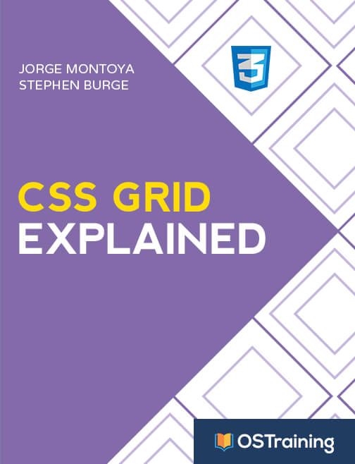
All Joomlashack Pro members get access to our "CSS Grid Explained" book. All you need to do is sign up for a Joomlashack extension, template or training membership.
In this short book, you are going to master the key ideas behind CSS Grid. This book is in the best traditions of OSTraining. There are no long-dense paragraphs of theory. You pick up the book and you start writing code immediately.
In the first chapter, we start with the basic terminology. You'll learn the difference between Grid Areas and Grid Cells, between Grid Tracks and Grid Gaps.
Then, using a hands-on approach, you'll start building CSS Grids. There are 9 different exercises in this book. You'll build everything from the most basic CSS Grid to a full site layout.
Our complete guide to CSS Grid
- CSS Grid #1: Everything Joomla users need to get started with CSS Grid
- CSS Grid #2: How to Use the Firefox Grid Inspector with CSS Grid
- CSS Grid #3: Understanding Explicit and Implicit Grids in CSS Grid
- CSS Grid #4: How to Use the Autoflow Property in CSS Grid
- CSS Grid #5: Determining the Size of the Tracks in CSS Grid
- CSS Grid #6: The Auto Keyword and Repeat Notation in CSS Grid
- CSS Grid #7: How to Size Grid Items with the Span Keyword in CSS Grid
- CSS Grid #8: How to Use Line Placing in CSS Grid
- CSS Grid #9: How to Layer Items Inside a CSS Grid
- CSS Grid #10: How to Name Grid Lines
- CSS Grid #11: How to Place Items with Grid Template Areas
- CSS Grid #12: The minmax() Function
- CSS Grid #13: The auto-fill and auto-fit Keywords in CSS Grid
- CSS Grid #14: Centering and Aligning Items in CSS Grid
- CSS Grid #15. The justify-content and align-content Properties
- CSS Grid #16. The grid-auto-flow: dense Property
- CSS Grid #17. Nesting Grids
- CSS Grid #18: How to Build a Dropdown Menu
- CSS Grid #19: Difference Between Grid Containers and Block Containers
- CSS Grid #20: Build a Teaser Gallery with Cards
- CSS Grid #21: How to Insert an Empty Row in CSS Grid
- CSS Grid #22: Theming a Footer with CSS Grid and Media Queries
- CSS Grid #23: Building a Hamburger Icon Menu
Summary
If you're building a template in Joomla 4, or are creating the frontend layout for an extension, don't rush into using Bootstrap 4. You should consider relying on CSS Grid instead.
This does not mean that all Joomla 4 templates will abandon Bootstrap. There are some good reasons that designers will continue to rely on Bootstrap. For example, we may continue to rely on Bootstrap for Joomlashack templates so that it's easier for our users to update.
However, the future is clear. Long-term, the future of Joomla frontend design is CSS Grid.