The Joomlashack Blog
You need to migrate to Joomla 3 now
- Written by Oscar Rodas Oscar Rodas
- Published: 10 November 2015 10 November 2015
Joomla! just released their last beta release 3.5.1. We will need to wait a little longer for the stable version.
For those of you keeping your sites up to date, this new release will be a common procedure. However, if you have not been updating your Joomla site, findings reveal the need to upgrade/migrate to the latest stable version. Doing this will eliminate risks from vulnerabilities possibly found in old versions.
Please, don't become part of the statistics.
Why migrate your site?
We cannot explain this better than the good folks from Joomla.org. Read their reasons HERE. In short: you NEED to upgrade your site!
Upgrade, Migration, and Web Development Services
- Written by Oscar Rodas Oscar Rodas
- Published: 23 February 2015 23 February 2015

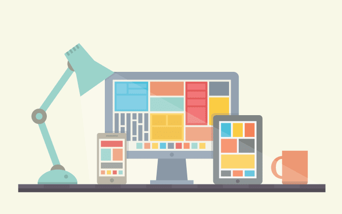
Web-Design Social Media Update
- Written by Joomlashack Joomlashack
- Published: 30 August 2014 30 August 2014

Social media is a pervasive part of today’s culture, whether you’re looking at it from a user standpoint or a marketing standpoint. The social web has the largest amount of traffic, endless user engagement and is the place to be to maintain any sort of web presence. Sharing buttons and integrated features are a commonly touted tool for Joomla templates, but with new social medias popping up practically every day, it’s important to figure out a good sharing balance, where to position your sharing buttons, and how many buttons are too many.
Which Sites to Share?
The first order of business is figuring out which social media sites are most appropriate for your website. You want to go with the high-traffic social media sites to start, such as Facebook, Google+, Reddit and Pinterest. Expanding further depends on your audience and your niche. Niche social media sites give you targeted traffic of those who are more likely to be interested in the topics you’re talking about, at the expense of having lower traffic volume. Take a look at where your target demographic likes to spend their time before deciding on other social media sites.
On the Grid: Tips for Grid Layouts
- Written by Joomlashack Joomlashack
- Published: 12 June 2014 12 June 2014
Grid Layouts Rock!
Nothing trumps a reliable, easy-to-use UI. No amount of killer graphics, clever landing pages, or HTML5 showboating can equal a site that displays information clearly and concisely. Grid-based layouts are a perfect tool to do that. They can present a huge amount of content at a glance, and are easy to update. But, keeping them interesting can be a challenge. Here are some tips to bring the "wow" factor.
Keep it cohesive
One of the dangers of this layout is that it can feel cluttered. You have to give it a seamless look. Grid layouts can't feel arbitrary. Your readers' attention gets scattered if the layout looks like it's thrown together. If you are using a lot of images (and it's not a news-based site), pick ones that are similar in color scheme or composition, like Canvas Magazine does with its neutral photos. Viktoria Klein uses images that are linked by color, pattern or content to add variety while still keeping the aesthetic flow.
3 Tips for an Effective Landing Page
- Written by Joomlashack Joomlashack
- Published: 23 May 2014 23 May 2014

Whether users are browsing via mobile or desktop, having a striking and easily understood landing page is vital for your clients' site and or business. The landing page is the first exposure to the site. As such, it's your opportunity to communicate the client's brand in a way that's memorable and useful. Here are some tips for creating a useful and unforgettable landing page that enables the site's traffic to navigate it as you intended while it acomplishes your client's objectives: builds their brand, generates leads, and increases their visibility.
5 must-read books on Web-Design
- Written by Joomlashack Joomlashack
- Published: 29 April 2014 29 April 2014

Web design is as much of an art as it is a science, especially if you're designing for demanding clients. The Internet has plenty of design inspiration and tips for building sites, but sometimes there's nothing quite like sitting down with a few good books to expand your skills, to gain a new perspective on design, or to refresh existing skills.
Continue reading to find our recommendation of "5-must read web design books" you need in your personal library.
Best Practices for Scrolling on Mobile Sites
- Written by Joomlashack Joomlashack
- Published: 22 April 2014 22 April 2014
Scrolling elements of site design are a major trend for 2014. So is browsing via mobile. You might not think that those two things should go together - - after all, scrolling on many mobile devices can be slow and clumsy, and the small text size can make scrolling a challenge. However, it seems to be the solution many have found for displaying on a small screen, their site's content in a legible and organized way. With mobile browsers constantly improving and more and more users wanting mobile sites to be memorable (not just usable), you need to embrace this growing trend.
Let's start laying the ground-work for some general rules you should keep in mind.
Which of the three is the best CMS platform for you?
- Written by Joomlashack Joomlashack
- Published: 15 April 2014 15 April 2014
How has website development changed?
With the rise of PHP to the top of the language heap in terms of developer adoption and web usage at-large, it's no surprise that the top three open-source web content management systems in use today are written in PHP, namely--Joomla, Drupal, and WordPress. While features and functionality are comparable amongst the three, deciding which system to implement can ultimately hinge on several factors that vary across organizations and roles.
Read more: Which of the three is the best CMS platform for you?
B&W or Rainbow? Choosing a Palette for Web Design
- Written by Joomlashack Joomlashack
- Published: 04 April 2014 04 April 2014
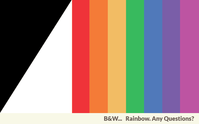
Whether you're exploring the whole RGB spectrum or bringing something fresh to black and white, color is one of the most important parts of website design. It's one of the first things users notice when they open up a site, and it instantly says a lot about the client and service or product they offer. Both color extremes are buzzing trends right now, so it's a great time to go ahead and experiment with using bold choices to add drama to your client's site. Here are some tips on when to go with monochrome and when to let your colorful fantasies play out.
Read more: B&W or Rainbow? Choosing a Palette for Web Design
Spring 2014 Must List
- Written by Joomlashack Joomlashack
- Published: 28 March 2014 28 March 2014

There are many things for web industries to look forward to in the spring. Some of the more popular web design trends include mobile first design, deeply focused landing pages, and putting a face with freelance web development. People are building better sites and writing better blogs, and these trends are at the heart of it all.
Mobile First Design
Yeah, yeah, seems like we've been talking about this ad nauseam, but I recommend that you look at some real stats for a change. Have a look at your analytics to see just how many mobile browsers visit your site these days. This trend has been going on for a few years now, but it's only now getting to the point of overtaking desktop clients - - at least for some sites. This makes responsive design increasingly more important. Please share with us what you find.